
(T2108 measures the percentage of stocks trading above their respective 40-day moving averages [DMAs]. It helps to identify extremes in market sentiment that are highly likely to reverse. To learn more about it, see my T2108 Resource Page. You can follow real-time T2108 commentary on twitter using the #T2108 hashtag. T2108-related trades and other trades are posted on twitter using the #120trade hashtag)
T2108 Status: 40.8%
VIX Status: 17.3 (a 43% increase!)
General (Short-term) Trading Call: Buy for a bounce
Reference Charts (click for view of last 6 months from Stockcharts.com):
S&P 500 or SPY
SDS (ProShares UltraShort S&P500)
U.S. Dollar Index (volatility index)
VIX (volatility index)
VXX (iPath S&P 500 VIX Short-Term Futures ETN)
EWG (iShares MSCI Germany Index Fund)
CAT (Caterpillar)
Commentary
In the last T2108 Update, I predicted that Wednesday’s strong surge to all-time highs for the S&P 500 would either lead to a quick correction or an April-long rally. I based this prediction on a combination of recent history of tags of the upper-Bollinger Band and the T2108 model. I tried to use the following day’s trade as an indicator of which fork in the road looked more attractive, but I ended up getting faked out instead. Today’s quick correction occurred as I was in the middle of accumulating SSO calls. The S&P 500 sold-off almost non-stop.


As a reminder, whenever T2108 first rises into a new “over-period”, in this case over 60%, downside risks are at their highest. The plunge to 40.8% ended BOTH the 60% and the 50% over-periods at 3 and 5 days respectively. Here are the charts of S&P 500 performance versus duration of the over-period. The red bubbles represent the projection of the relationship.


I think my biggest lesson here is that I need to remember to keep the analysis simple. In this case, I should stick with the downside odds until the duration of the over-period reaches the switching point where a positive gain is most likely at the end of the over-period. For reference, the S&P 500 lost 0.7% for the 50% over-period and lost 2.2% for the 60% over-period.
Now, the tables are turned. T2108 is in the 50% under-period, but walking on the thin line of the 40% under-period. For the next 30-trading days there is a positive bias as shown below.

More importantly, T2108 triggered another quasi-oversold condition by declining 37% over two days. Unlike the last quasi-oversold condition, the T2108 Model this time predicts that the S&P 500 will close up tomorrow (Tuesday, April 16). The huge surge in the VIX is the key pivot point this time around. The decision is extremely simple for the T2108 2-day decline model. If the VIX increases by at least 15.5% on the second day of the decline, then the S&P 500 will close up the following day with an 80% probability. Since I have already accumulated SSO calls, I am already positioned for this prediction. If the market does not move up too fast in the morning, I will add more SSO calls. Given the last (surprising) prediction of a down day with a 74% likelihood ended up falling flat, I will be pretty disappointed if this prediction also falls flat. I will have to re-examine some of the tools in the kit! Note that for the first prediction, the S&P 500 declined on the second day, and I was still able to profit well. For this prediction, I am even more confident given the close proximity of 50DMA support. I am definitely inclined to hold onto these calls (they do not expire until the regular May expiration).
My VXX shares soared nicely by 11.8%, and I promptly bought fresh puts expiring in May. I was fortunate to lock in a sliver of a profit on the April-expiring puts at the beginning of trade.
As I type, currencies are supporting my expectation of a relief bounce. After steady declines going into the U.S. trading session, the sell-offs became calamitous after trading ended and as Asian trade approached. The U.S. dollar and the yen were the primary beneficiaries and the Australian dollar was the biggest victim. Here is 15-miunte intraday chart of AUD/JPY that combines the weakest and the strongest for the best emphasis followed by a daily chart showing the bounce from support:


Like the Aussie, the euro (FXE) and the British pound (FXB) just about recovered all their losses against the yen from Monday’s trading. This is about as wicked a whipsaw as one can imagine. It is a reminder and vindication (for now!) of my plan to stick with short yen, long Australian dollar with rotating hedges while slowly accumulating the core positions. (“Latest China GDP Figures Set Up Next Buying Opportunity” describes my fundamental and trading thoughts following what I think is an over-reaction to the Chinese economic data).
I would be remiss if I did not end this piece with charts on gold and silver. Both precious metals took historic beatings on Monday. Gold’s 8% loss was the largest single-day decline in 33 years. Silver dropped 11% but it had a similar decline back in September, 2011 that ended the previous bull rally with an exclamation point. I covered my thoughts on gold the day before disaster really struck in “3 Reasons Why A New Bottom For Gold Will Likely Prove Elusive For Now.” I will have to print follow-up thoughts because I strongly suspect folks are finally giving up on gold and silver just when it might be of most value. We shall see. Accordingly, I added to silver positions. I will add yet more gold tomorrow. I will then wait patiently to see what unfolds from there.


Source for gold and silver charts: StockCharts.com
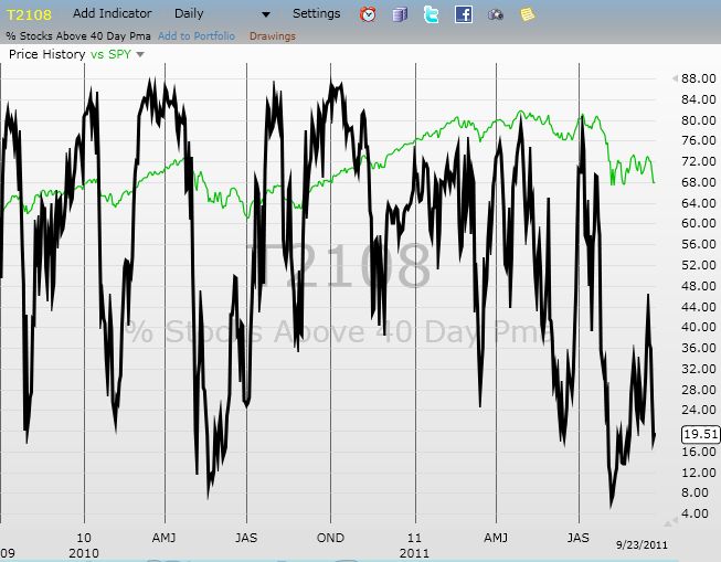
Daily T2108 vs the S&P 500
")
Black line: T2108 (measured on the right); Green line: S&P 500 (for comparative purposes)
Red line: T2108 Overbought (70%); Blue line: T2108 Oversold (20%)
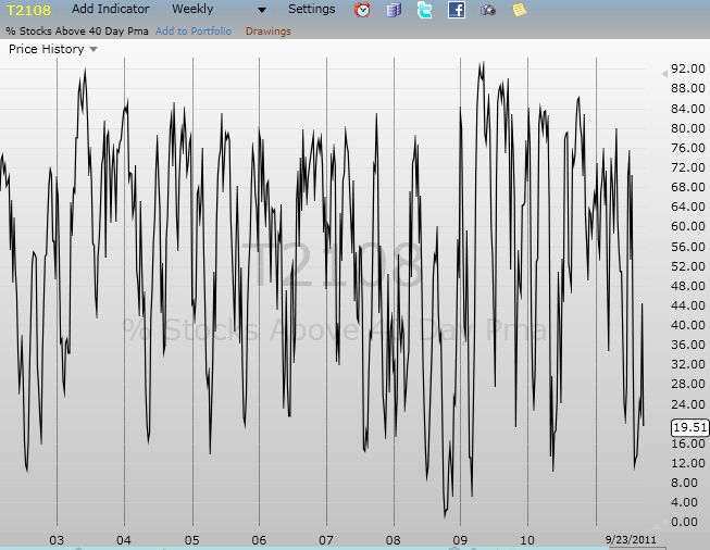
Weekly T2108

*All charts created using freestockcharts.com unless otherwise stated
Related links:
The T2108 Resource Page
Expanded daily chart of T2108 versus the S&P 500
Expanded weekly chart of T2108
Be careful out there!
Full disclosure: long VXX shares and puts; long AUD/JPY (net long Australian dollar); net short Japanese yen; long GLD and SLV