(T2108 measures the percentage of stocks trading above their respective 40-day moving averages [DMAs]. It helps to identify extremes in market sentiment that are likely to reverse. To learn more about it, see my T2108 Resource Page. You can follow real-time T2108 commentary on twitter using the #T2108 hashtag. T2108-related trades and other trades are sometimes posted on twitter using the #120trade hashtag. T2107 measures the percentage of stocks trading above their respective 200DMAs)
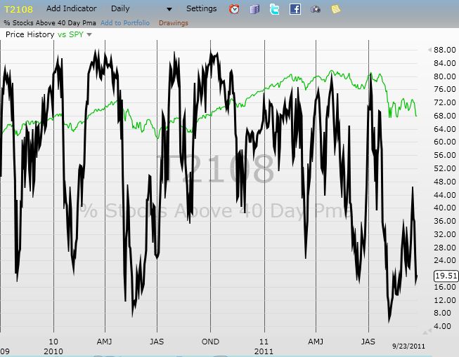
T2108 Status: 63.5% T2107 Status: 52.8% VIX Status: 13.3 (increase of 10.4%) General (Short-term) Trading Call: Hold (bullish positions) – see below for caveats Active T2108 periods: Day #29 over 20%, Day #27 over 30%, Day #24 over 40%, Day #22 over 50%, Day #17 over 60% (overperiod), Day #99 under 70% (underperiod)
Reference Charts (click for view of last 6 months from Stockcharts.com): S&P 500 or SPY SDS (ProShares UltraShort S&P500) U.S. Dollar Index (volatility index) EEM (iShares MSCI Emerging Markets) VIX (volatility index) VXX (iPath S&P 500 VIX Short-Term Futures ETN) EWG (iShares MSCI Germany Index Fund) CAT (Caterpillar).
“@howardlindzon: Never seen an energy sea of red like this in Stocktwits trending … $USO #oil http://stks.co/d1Inj” A sea of red for energy-related stocks
This post on StockTwits says it all for the a holiday-shortened day of trading in the U.S.
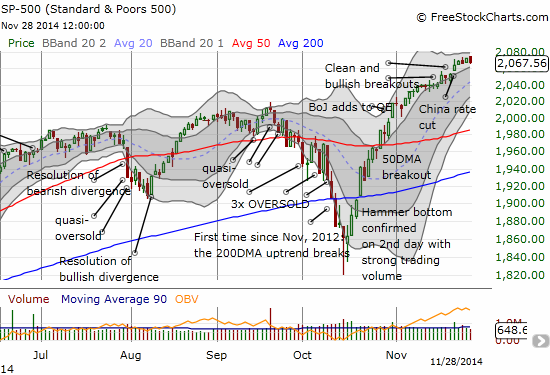
OPEC confirmed it is trapped into continuing to produce oil into a declining price environment, and the results in the oil patch were dramatic. The impact was far-reaching as it seems the entire commodities-related complex went into a freefall on the day. So, I can excuse T2108 from backing off over-bought conditions as it tumbled 4 percentage points to 63.5% despite the S&P 500 barely budging to the downside.
The S&P 500 does not even show a hint of the carnage extending throughout the world of commodities
My tune will get bearish if the S&P 500 follows through with more selling next week that produces a close below 2052 or so. This would close the gap up from the surprise Chinese rate cut. It would also end the nice uptrend through the channel creates by the first and second Bollinger Bands (BB).
There was also an interesting dichotomy in the two main resource-related currencies: the Canadian dollar (FXC) and the Australian dollar (FXA).
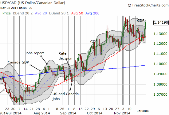
Canada delivered great GDP growth results for the previous quarter, but it was not enough to slow down the commodities train wreck:
The Canadian dollar weakens despite a strong GDP print – selling in the oil-patch dominates trading
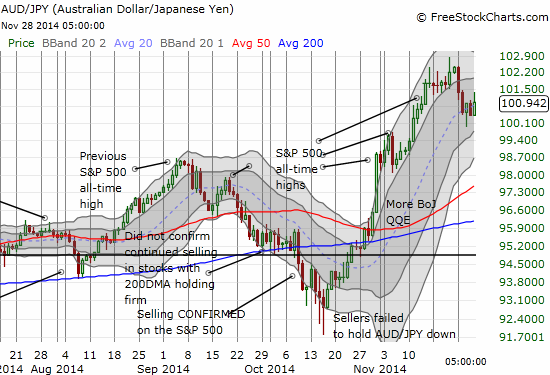
Given this move, I would expect the Australian dollar to get absolutely hammered. Quite the opposite. AUD/USD actually RALLIED and ended the day with a gain despite a late pullback. Most important for trading purposes, the Australian dollar held firm against the Japanese yen (AUD/JPY). This made my buy of the dip earlier in the week even more fortuitous. I thanked my lucky stars and snatched my profits.
The Australian dollar versus the Japanese yen holds firm against otherwise bearish signals taking root elsewhere
Despite my hasty exit from the long AUD/JPY position, I still consider this current stability a strong signal that invalidates any bearish misgivings I may otherwise harvest. I just did not want to leave these profits on the table over the weekend. Regardless, you can bet that I am watching AUD/JPY even more closely now.
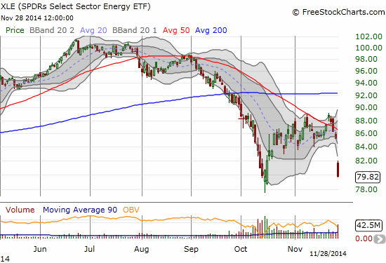
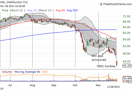
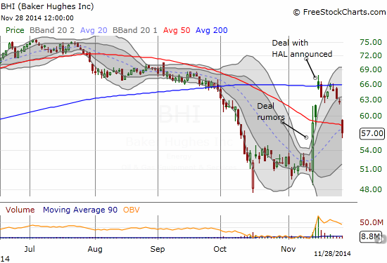
Readers may recall my fortuitous short of XLE that was interrupted by the Halliburton Company (HAL) deal to acquire energy services competitor Baker Hughes Incorporated (BHI). As luck would have it, I could have held that short position even if it meant watching my profits melt away before hitting the real jackpot.
With only a half day of trading available, traders rushed for the XLE exiits with particular speed and alacrity
This breakdown in XLE is a classic follow-through of a bearish break of the 50DMA just two trading days ago. Technically, I should have been all over that move. My only defense is that I had little interest in trying to out-guess the politicizing and strategizing surrounding the OPEC meeting.
Now that the cat is out of the bag – and perhaps we are witnessing the beginning of the end of OPEC as we have come to know and love – trading opportunities abound. The FIRST thing that came to my mind is that HAL may have to back down out of its deal for BHI. The collapse in its stock price back to June, 2013 levels means that the deal for BHI has gotten ever more expensive. HAL is handing over 1.12 HAL shares and $19 in cash for every share of BHI. Those shares are now worth a lot less. Perhaps BHI will still be grateful for its savior and accept the same price. Perhaps this on-going plunge in oil prices does not change a thing. Maybe it even makes the deal MORE attractive because of supposed cost synergies. But just in case the odds of a deal collapse just got higher, I had no problem rushing in to buy April call options on HAL against April put options on BHI. Moreover, I think the out-sized beating being delivered to HAL is an expression of growing displeasure with the deal.
Traders rush for the exits from HAL in a massive display of force. An 11% loss in just one day.
BHI is on its way to losing even the rumor-driven premium from the HAL deal
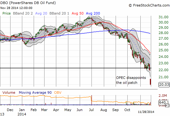
This trade should pay off if the deal collapses and HAL regains whatever premium it lost and BHI rushes downward to catch up to the rest of its cousins in the oil patch. It should also pay pay off if oil somehow finds a bottom and starts rallying again at some point soon. However, the gap down in DBO suggests that the latter is NOT the likely scenario.
A massive gap down for DBO as it loses 8.8% in one day
Heck, if oil completely collapses going forward, this trade could even come out at least even as HAL and BHI tumble together. (Late addendum: someone on stocktwits informed me that HAL has to pay BHI a $3.5B termination fee if the deal falls through. So the bar for a collapse in this deal is VERY high!)
In the meantime, we have a BUNCH of stocks in the oil patch and commodities in general that look over-extended below their lower Bollinger Bands. I will not be surprised to see buyers rush in on Monday on the presumption that the low liquidity of shortened holiday trading exacerbated the downward action. This relief bounce should be very fade-able as the negative feedback loop is now firmly entrenched in the oil patch.
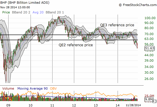
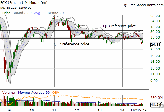
Just so you understand that the sell-off had far-reaching impact in the commodities space, I conclude with charts of Freeport-McMoRan Inc. (FCX), BHP Billiton Limited (BHP), and Rio Tinto plc (RIO).
FCX has some amount of oil-related assets but is mainly known for its copper mining. BHP is a very diversified miner with oil-related assets. RIO is much more a pure play on iron ore. I recently bought FCX as part of a desire to start scaling into the commodity collapse while the getting is good. I started with copper because it does not have the negative fedback loops working against it like iron ore and oil. I am still VERY bearish on iron ore, and I recently re-established a (hedged) bearish position in RIO. The prices in the chart for RIO show the approximate spot price of iron ore on that day. I left BHP alone because of its diversified position. I did not even think for a hot minute that a collapse in the oil patch could take BHP down so dramatically. I show weekly charts for FCX and BHP to show the seriousness of the breakdowns.
As a reminder, the QE2 and QE3 reference price marks where the given stock traded at the time the U.S. Federal Reserve announced its quantitative easing programs. So much for money-printing supporting and propping up asset prices in commodities!
The collapse in BHP Billiton Limited (BHP) is well underway as major multi-year support gives wayFreeport-McMoRan Inc. (FCX) flirts with a major multi-year breakdown
No fresh multi-year low for RIO….yet. Perhaps the hopes of a Glencore savior is keeping the stock aloft.
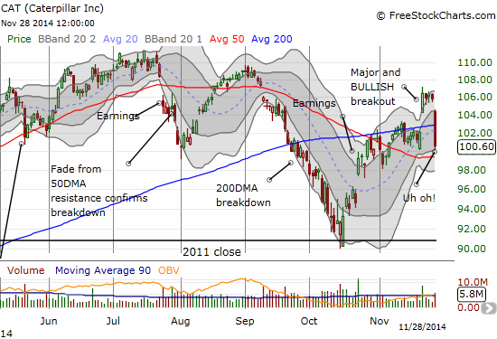
Finally, I cannot conclude this post without showing the pounding Catepillar (CAT) took today. THIS chart gives me pause, and I am very happy to have a hedge riding on the back of CAT. If it breaks its 50DMA, look out below. Note how volume surged DESPITE the shortened trading day. Yikes.
Caterpillar reverses and invalidates the bullish breakout. Only the 50DMA sits between here and a bearish breakdown.
Daily T2108 vs the S&P 500
Black line: T2108 (measured on the right); Green line: S&P 500 (for comparative purposes)
Red line: T2108 Overbought (70%); Blue line: T2108 Oversold (20%)
Full disclosure: long SSO shares, short USD/CAD, long HAL call options, long BHI put options, long RIO call and put options, net long the Australian dollar, FCX


")
