
(T2108 measures the percentage of stocks trading above their respective 40-day moving averages [DMAs]. It helps to identify extremes in market sentiment that are likely to reverse. To learn more about it, see my T2108 Resource Page. You can follow real-time T2108 commentary on twitter using the #T2108 hashtag. T2108-related trades and other trades are occasionally posted on twitter using the #120trade hashtag. T2107 measures the percentage of stocks trading above their respective 200DMAs)
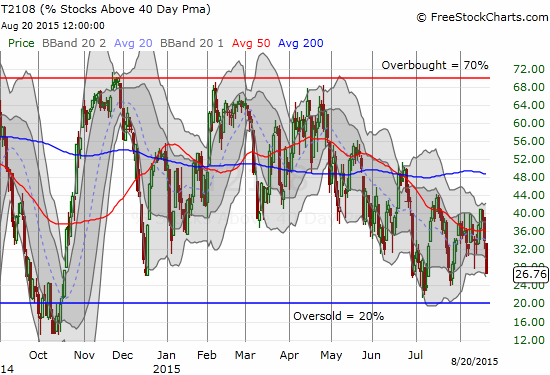
T2108 Status: 26.8%
T2107 Status: 31.0%
VIX Status: 19.1
General (Short-term) Trading Call: Cautiously bullish
Active T2108 periods: Day #209 over 20% (overperiod), Day #1 under 30% (underperiod), Day #24 under 40%, Day #64 under 50%, Day #81 under 60%, Day #280 under 70%
Reference Charts (click for view of last 6 months from Stockcharts.com):
S&P 500 or SPY
SDS (ProShares UltraShort S&P500)
U.S. Dollar Index (volatility index)
EEM (iShares MSCI Emerging Markets)
VIX (volatility index)
VXX (iPath S&P 500 VIX Short-Term Futures ETN)
EWG (iShares MSCI Germany Index Fund)
CAT (Caterpillar).
Commentary
“Overall, the market is exhibiting signs of increasing instability as it swings in manic fashion from strong rallies to strong selling. The net result of this amplified chop is a vicious stalemate between bears and bulls. However, all the elements seem to be converging for a very large breakout/down. While my short-term trading bias sits at neutral, I am eyeing the bearish case most closely right now.” – from my last T2108 Update, August 12, 2015.
T2108 has avoided oversold territory for an incredible 209 straight trading days. This streak is emblematic of the stock market’s stubborn resiliency. On a shorter timescale, the ability of the S&P 500 (SPY) to quickly bounce away from 200-day moving average (DMA) support provided mini-confirmation of the market’s resiliency….until now.
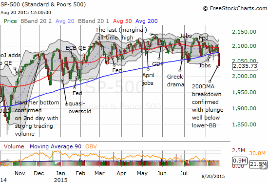
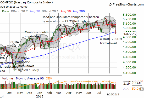
The S&P 500 lost 2.1% on the day and is now back in the red for the year. The drop was near relentless with the index finishing the day closing on the low. The sell-off marked a clean breakdown of 200DMA support just a day after the index pulled off another of its magical saves at the 200DMA. Even the NASDAQ (QQQ) succumbed to a now RARE breakdown below its own 200DMA. Both indices are trading well below their lower Bollinger Bands (BBs) and are oversold on that basis, especially the S&P 500. This is the index’s lowest close relative to the Bollinger Band since at least last October and perhaps longer. This milestone alone looks like a rubber band ready to snap back.
T2108, my favorite technical indicator, closed at 26.8%. Below 30%, it is now “close enough” to oversold conditions to consider making some bullish trades. Notably, T2108 is finally lagging the S&P 500 as the indicator has not yet made a new low. That achievement would take a close into true oversold territory.
On the other hand, T2107, the percentage of stocks trading below their respective 200DMAs, HAS made a new low. It is back to levels last seen in October, 2014. This important indicator of underlying market strength has been in definitive decline since May; T2108 has also been in decline but it stopped making new lows last month. Every failure to close above the previous high for T2107 made me more and more wary.
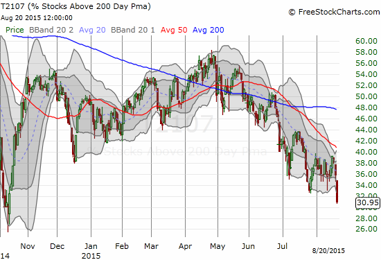
T2107 is acting like an anchor wrapped around the market’s ankles. This weight is made further poignant by the following stat provided by Nightly Business Report: 25% of the components of the S&P 500 are now 20% or more lower than their highs; 33% of the Dow Jones Industrials (DIA) have done the same. It is a little dramatic to say individual stocks are in a bear market, but “bear market” is indeed the term NBR used for these hapless stocks.
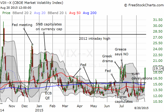
Next up is the volatility index, the VIX. Yesterday, the VIX popped right to the important 15.35 pivot point and stalled. TODAY, the tentativeness disappeared into a 25.5% surge. With the volatility index well above its upper-Bollinger Band, I automatically triggered buys of put options on ProShares Ultra VIX Short-Term Futures (UVXY). This was a more aggressive move than the single put option I bought the day before as a play on the 15.35 pivot becoming resistance again. Trading against that pivot has worked like a charm during setups like last week.
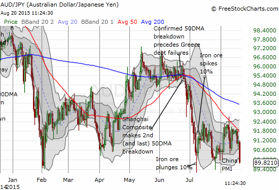
And then there is the Australian dollar (FXA) trading against the Japanese yen (FXY). I use AUD/JPY as an additional check on market sentiment. AUD/JPY had been holding up well but was consistently unable to break through resistance at its 50DMA. Tonight, bad economic data from China helped to send AUD/JPY plunging right back to recent lows. This augurs poorly for Friday’s trading action – at least at the open.
Putting all these indicators together, I am cautiously bullish in the immediate-term, but very wary beyond that. The technical signs are still troubling. The market is stretched out with negativity and bearishness. As regular readers know, my ideal next step from here is to see the market gap down in order to clear out a large number of panicked sellers. I dump a lot of bearish positions into the bumrush and begin aggressively fading UVXY and accumulating call options on ProShares Ultra S&P500 (SSO). At that point, the S&P 500 drops into an even more severe oversold condition – ideally below 20% on T2108 – into which buyers rush into the vacuum. At a minimum, this scenario sends the market into a gap fill if not a complete reversal of recent selling. Yet, I never seem to get this ideal sequence!
Here is what I have done over the past two days on T2108-related trades…With T2108 trading around 30% on Wednesday, I bought a single put option on UVXY. With sellers continuing to press the S&P 500 today, I bought more put options. On even more selling, a limit order on a fistful of SSO call options filled. If my ideal scenario unfolds on Friday morning, I will greatly expand these holdings. Otherwise, I will look to take profits into the next rally.
The next rally SHOULD take the S&P 500 back to the lower-Bollinger Band at a minimum. Next up from there is a rendezvous with the 200DMA which is now resistance. I am VERY pessimistic on the prospects for the index to break through this time. The 200DMA has been severely tested too many times. There are simply too many negative fundamental and technical catalysts for me to believe an oversold bounce can sustain itself through tough resistance. (Notably, housing sticks out as a large positive. Moreover, the prospect of the Fed finally admitting it will punt on rate hikes would send the market hurtling higher…at least until folks absorb the negative implications of such a decision.)
Adding to my growing pessimism are the various technicians I keep reading who are singing the same bearish song with a confluence of reinforcing indicators.
For example, on August 18th, in “Market is at ‘historical extremes’: Technician,” CNBC relates an incredible extreme:
“There hasn’t been a 5 percent pullback in the S&P 500 since December,” Jonathan Krinsky said Tuesday on CNBC’s ‘Futures Now.’ Krinsky noted that while the occurrence isn’t unprecedented, the last time the S&P 500 went a full year without a 5 percent decline was 20 years ago in 1995, and there were only four times before that in 1964, 1961, 1958 and 1954. In each of those years, the market posted an average return of 30 percent.”
And this is JUST a 5% decline! The market has bounced so reliably from shallow selling and has stayed within such a narrow band that a 5% decline will surely feel awful. Such sentiments will be sorely overdone.
Even more fascinating, is Tom McClellan’s prediction of a sell-off. On August August 17th, I read “Market timer Tom McClellan sees stocks set up for ‘ugly decline’ as early as Thursday” in Marketwatch. Reading about the background of one of the most famous market technicians around made this article worth reading. The assemblage of convincing signals made this a true delight to read. As it turned out, McClelland absolutely nailed the timing of an “ugly decline” right to the day. We will have to see whether he is correct about an ensuing sell-off. As I noted above, I will NOT be surprised to see follow-through selling, particularly after the market works off the current oversold conditions. Here are some of the best tidbits from the article on the technical signals:
“At the moment, they are telling him to be bullish on the stock market for all of his trading time frames, including those that trade every few days, weeks and months. But bulls should be ready to flee, as soon as this week.
For one, the advance-decline line, which tracks the number of stocks participating in a trend, started declining nearly four months ago.
…liquidity in the financial markets is about to dry up, as investors prepare for the Federal Reserve’s inevitable interest-rate hike.
‘We are already seeing confirming signs of liquidity problems in the weakening [advance-decline] line, which topped back in April and appears to be setting up for a major divergence [from the S&P 500], similar to 2000 and 2007,’ McClellan wrote in a recent newsletter.
Other charts supporting the bearish view include the leveling off of Treasury and mortgage-backed securities held by the Federal Reserve after the end of quantitative easing, and the high level of taxation relative to gross domestic product.”
McClellan struck at least three chords with me. 1) The topping in the advance/decline line roughly coincides with the current tops in T2108 and T2107. 2) Liquidity is the critical lifeblood of the market. Lack of liquidity is lack of buying power to keep asset prices propped up. Today’s breakdown has the markings of a rush for the exit to get out of the way of liquidity problems. 3) The high relative level of taxation acts as a drain in liquidity. I reproduce the relationship below using non-seasonally adjusted, quarterly, nominal Federal tax receipts divided by gross domestic product.
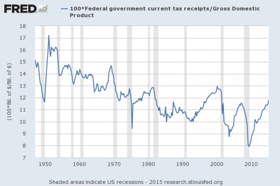
Source: US. Bureau of Economic Analysis, Federal government current tax receipts [W006RC1Q027SBEA], retrieved from FRED, Federal Reserve Bank of St. Louis, August 21, 2015; US. Bureau of Economic Analysis, Gross Domestic Product [GDP], retrieved from FRED, Federal Reserve Bank of St. Louis, August 21, 2015.
The good news is that this chart shows the Federal government’s take of GDP has tended downward for generations now. This should reassure those who fear the Federal government has increasingly sucking the life out the economy with taxes (although it might dismay those who see in this chart one source of the Federal government’s ballooning public debt). The bad news is that almost every recession in the post-War period has been preceded by a steady and sometimes sharp rise in the government’s share of GDP. The longest streak was in the 1990s. We need to hope the current streak can last that long…
Anyway, the point is that as the government’s tax collection recovers along with the economy and counter-cyclical, tax negative policies recede from the scene, the liquidity the government sucks back in cannot go into the financial markets. It is simple supply and demand to conclude that at some point the money that would go into investment will dry up enough to help trigger a recession. (This one factor is of course insufficient to predict the timing of a recession, especially since we cannot tell ahead of time how long the recovery in the government’s share can/will last).
Finally, let us not forget the “Fleckenstein indicator” which is flashing bright red. Fleck was itching to short the market at the beginning of this month. He is probably falling out his chair in eagerness now.
If you have made it this far in the post, you could be itching to see some individual charts for examples of the market’s latest carnage. There are of course a plethora of charts I could show. What I provide below is but a small sample.
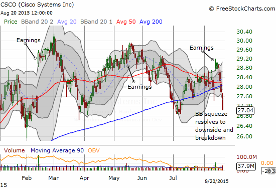
Cisco (CSCO) provided some brief optimism in tech with an impressive post-earnings gap up. That gap has closed and now CSCO has made a very bearish breakdown below both its 50 and 200DMAs. While CSCO is just as over-extended as the general market, a break of last month’s low will confirm a bearish turn in character for tech’s dominant provider of internet gear.
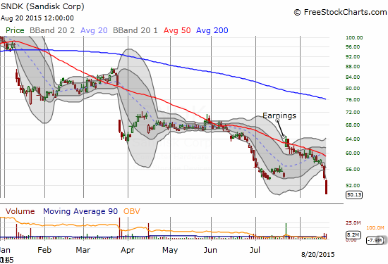
Sandisk (SNDK) suffered similarly to CSCO except it is struggling with an extended downtrend from 2014’s double top. I actually had a put in play on SNDK to play resistance at its 50DMA. I sold the put into Wednesday’s sell-off that took SNDK below its lower-BB. I thought THAT was over-extended enough!
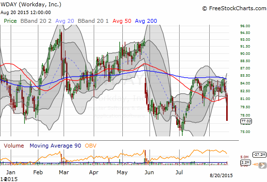
Workday (WDAY) broke down so badly I scrambled to find some news. I found none! WDAY is one of those premium valued stocks. Surprisingly, the stock has traded in a wide range for over a year. A break of last month’s low should send WDAY to a quick retest of the lows from 2014’s massive sell-off of (former) momentum stocks. In the meantime, WDAY is at the top of my list for stocks to buy on a market bounce. There is a LOT of upside potential here for such a bounce as WDAY has traded amazingly low relative to its lower Bollinger Band.
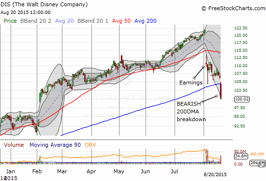
Speaking of devastating breakdowns, Disney (DIS) got absolutely slammed today with a vicious follow-through to post-earnings selling. I bought into the initial post-earnings selling with a 2017 call option and a short-term call option that I quickly flipped for a nice profit. My next try at flipping short-term call options is currently failing as I hoped against hope that DIS’s 200DMA breakdown would turn into a massive headfake instead of a massively bearish move. I told one person on StockTwits that if I were bearish on DIS, I would have immediately shorted the stock on its break of 200DMA support. I think the chart speaks volumes. DIS could very well be on its way to filling February’s gap up and returning ALL its gains for 2015 before buyers are able to mount a successful counter-offensive. Note that DIS is one of the stocks trading in “bear market” territory.
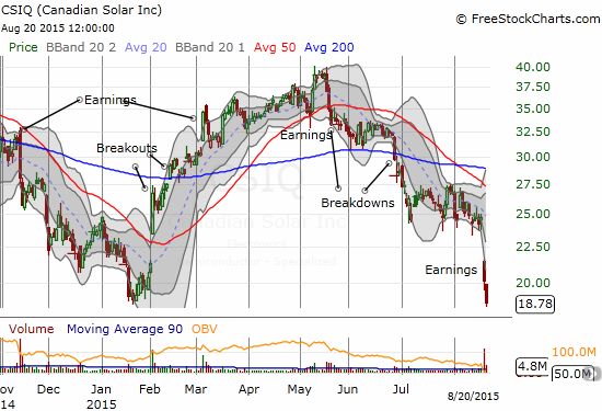
Canadian Solar (CSIQ) garners a lot of love from investors and traders on social media. I see the praises heaped on this stock constantly. But I have seen few acknowledge the increasingly bearish technicals on CSIQ. CSIQ experienced two important and sustained breakdowns ahead of this week’s earnings which confirmed the bearish turn in the stock. With a test of 2015 lows and an extension well below its lower-BB, CSIQ joins WDAY on my shopping list for oversold bounces.
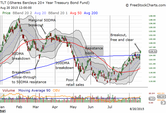
I feel vindicated on the iShares 20+ Year Treasury Bond (TLT). My call spread is now well in the green. I am staying firmly grounded in my position as I am even more convinced the Fed is going to signal ever more tentativeness about rate hikes. The current 200DMA breakout positions TLT for a next leg up that could unfold relatively quickly.
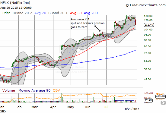
Netflix (NFLX) had one helluva a headache today. The stock is now an official wildchild as it lost 7.8% on the day. This was NFLX’s largest one-day loss since its large post-earnings gap down in October of last year. NFLX is on my “aggressive buy list” so I was primed to go in today’s sell-off. My first purchase at 20DMA support looked good for just a hot minute. As the stock continued to melt, I moved in on a second tranche with a lower strike. My limit order got filled toward the end of the day. I expect big things from NFLX on an oversold bounce. Of course, if the market’s sell-off really gets going, NFLX is PROBABLY the kind of stock folks will dump with reckless abandon in order to preserve profits.
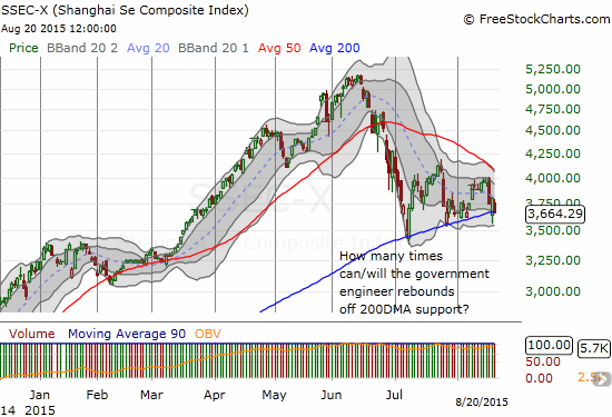
My favorite measure of market manipulation, the Shanghai Composite (SSEC) is still magically holding with the 200DMA as support (hmm….sounds familiar). The Chinese government will have to try some new tricks soon as the index clearly is having trouble sustaining upward momentum from the line of support the government is so clearly trying to defend.
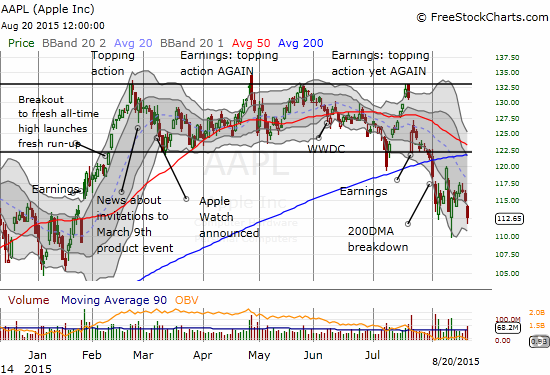
Often last, but never least, is Apple (AAPL). AAPL led the market with its major 200DMA breakdown at the start of August. Unlike with Disney, I immediately turned bearish on AAPL at that point. I continue to look for excuses to play AAPL’s short-term upside, but I continue to think AAPL has further to go on the downside. AAPL made a marginally lower close for this cycle. The good news is that it did not break intraday lows. So, the stock has at least the potential to set up a new trading range going forward…especially if CEO Tim Cook is applying his company’s many billions to more stock buybacks.
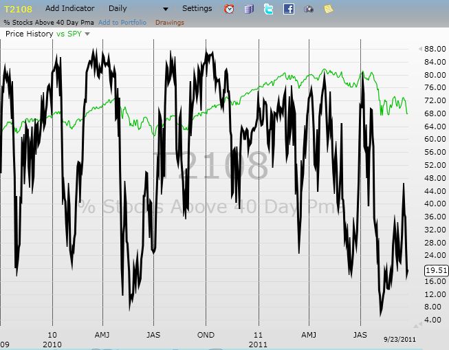
Daily T2108 vs the S&P 500
")
Black line: T2108 (measured on the right); Green line: S&P 500 (for comparative purposes)
Red line: T2108 Overbought (70%); Blue line: T2108 Oversold (20%)
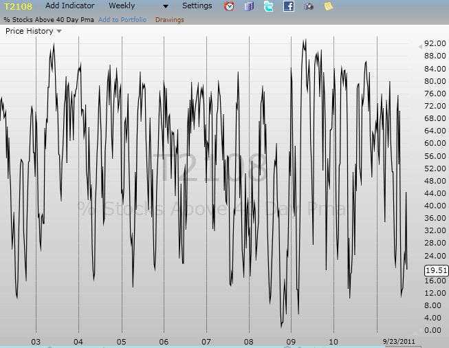
Weekly T2108

*All charts created using freestockcharts.com unless otherwise stated
The charts above are the my LATEST updates independent of the date of this given T2108 post. For my latest T2108 post click here.
Related links:
The T2108 Resource Page
Expanded daily chart of T2108 versus the S&P 500
Expanded weekly chart of T2108
Be careful out there!
Full disclosure: long UVXY puts, long SSO call options, long AAPL put spread and call options, long NFLX call options, short AUD/JPY, long TLT call spread, long DIS call options