
After watching Boston Federal Reserve President Eric Rosengren speak at the South Shore Chamber of Commerce in Quincy, MA, I concluded Rosengren did not intend to rock the stock market on September 9, 2016. Ironically, the market’s extremely low volatility and lofty levels make the market “vulnerable” to good news. Good news drove Rosengren’s upbeat assessment about the health of the American economy and his deference to the market’s ability to price risk appropriately.
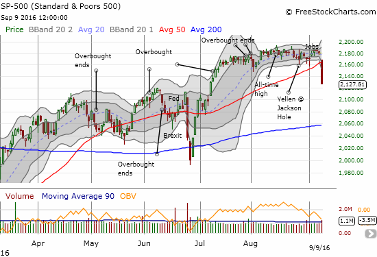
Source: FreeStockCharts.com
September started with a surprisingly and very weak ISM Manufacturing number for August that initially caused selling in the market, but buyers stepped in to take the S&P 500 (SPY) well off its lows. Over the next two days, the index rallied back to the edge of fresh all-time highs. That rallied started with a U.S. jobs report that generated fewer jobs than expected (151,000 vs 180,000). The week before, on August 26, a disappointingly low U.S. 2Q GDP print barely even registered on the S&P 500 as the index rallied for a small gain on the day. Net-net and on the surface, the market was hardly bothered by important economic data points which all reportedly came in weaker than expected.
Rosengren looked back on the data and saw a different story. He saw a GDP report that suggested economic activity would be strong in the second half of 2016. The low GDP numbers came from unanticipated inventory drawdowns from companies hesitant to commit to production because of (global) uncertainties. According to Rosengren, the hesitation is now in the rearview mirror and companies will now rebuild inventories in the second half of 2016. As a result, he expressed confidence in GDP forecasts that range from just below 3% to just above 3%. Rosengren produced the following chart to show the outsized influence of inventory drawdowns on GDP.
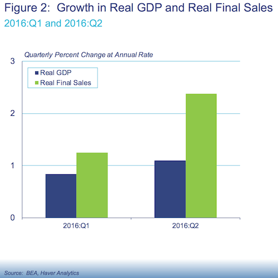
Source: “Exploring the Economy’s Progress and Outlook” – Eric Rosengren (9/9/16)
On the jobs front, Rosengren focused on the number of jobs needed to maintain the current unemployment rate (now at 4.9%). The chart below shows that for at least a year, the economy has added jobs well above the level of stabilization. Rosenberg concluded form this trend that the unemployment rate will continue declining in coming months. So instead of a weak August report, Rosengren saw a report consistent with lower unemployment in the near future.
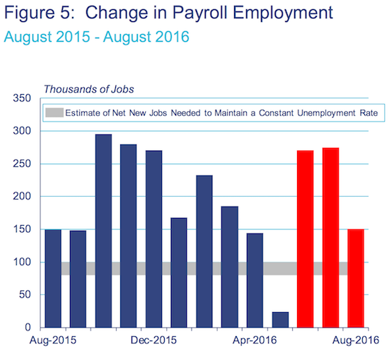
Source: “Exploring the Economy’s Progress and Outlook” – Eric Rosengren (9/9/16)
Throughout mainstream financial media, the reporting found a clincher in Rosengren’s commentary on a commercial real estate sector that may be getting a little overheated. For example, Marketwatch published an article titled “Fed’s Rosengren backs interest-rate hike amid concerns on asset prices“. Yet, to me, from reviewing the entirety of Rosengren’s speech and data, the bigger clincher was Rosengren’s chart showing the relationship between unemployment and the Federal funds rate. Rosengren argued that recessions are caused by policy mistakes and/or unexpected shocks. Given that framework, Rosengren claimed that recessions occur so closely on the heels of a combination of low unemployment and rate hikes because the Fed in the past waited too long to start raising. The delay in turn caused the Fed to hike too fast thus tightening monetary conditions rapidly enough to trigger a recession.
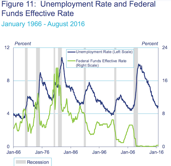
Source: “Exploring the Economy’s Progress and Outlook” – Eric Rosengren (9/9/16)
While the above chart is thought-provoking, it does NOT (and cannot) say exactly when the economy reaches the level of unemployment, when combined with a certain pace of rate hikes, that causes a recession. The Fed has to make a judgement call based on other economic context; this very reality has caused the Fed to hesitate to the nth degree over the past 18 months or so.
In the past, I have pointed to a similar chart that I think works even better than Rosengren’s to demonstrate the recessionary influence of tight labor markets and Fed rate hikes.
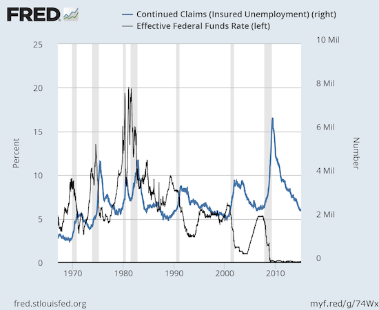
Source: US. Employment and Training Administration, Continued Claims (Insured Unemployment) [CCSA], retrieved from FRED, Federal Reserve Bank of St. Louis, September 12, 2016.
This chart of continued claims for unemployment insurance versus the Federal funds rate shows an apparent floor around 2 millions in continued claims that has held over multiple economic cycles. Fed rate hike cycles coincide a bit closer to these floors than to the periods of low unemployment. I think a case can be made that the Fed’s response function more closely aligns to continued claims than to the unemployment rate.
This 2 million floor is admittedly surprising given the growth in the overall labor force over the decades. I would have expected a floor that grows with the labor force. Yet, the historical data suggests this floor is in place, and the economy is approaching that floor yet again. Claims are already at the level where the Fed STOPPED hiking rates in the last cycle. Perhaps Rosengren’s warning about tardy rate hikes is already too late…or maybe the 2 million floor is the absolute final floor.
Rosengren’s speech also contained tremendous ironies. At one point, Rosengren pointed to a chart of the volatility index, the VIX, as evidence that financial markets are not worried about a fragile economy. The response from the market demonstrated that fragile global markets are not the only drivers of the VIX. As I noted in a prior post, only ten other days since 1990 have delivered larger one-day gains in the VIX.

Source: FreeStockCharts.com
Rosengren completed the irony by pointing to lofty global stock market indices as more evidence of global calm and contentment with current conditions.
Source: “Exploring the Economy’s Progress and Outlook” – Eric Rosengren (9/9/16)
I think after dust settles from whatever pullback is unfolding, Rosengren will sharply remember why the Federal Reserve traditionally ignores the stock market as an indicator of the health of the economy.
Be careful out there!
Full disclosure: long SDS, long SSO calls and puts, long UVXY and short UVXY calls, long SVXY puts