In early April, 2015, I simplified my Apple Trading Model (ATM). I examined the historical data to determine whether Apple’s (AAPL) open contained all the information needed to trade the stock on the day. I had an “ah ha” moment when I discovered that AAPL tended to trade in the same direction of its open. That is, if AAPL opened at a higher price than the previous trading day’s close, the stock tended to close at a higher price than the open…and vice versa.
As I traded to try to take advantage of this relationship, my actual results seemed a lot more random than the historical data suggested. I tweaked criteria for entry and kept trying the trade for a few months with little to no change in fortunes. After July, 2015 earnings, AAPL looked like it had finally topped out. A breakdown below the 200-day moving average (DMA) sealed the deal. AAPL’s tone was decidedly bearish, and there was little need for a trading model. My simplified model slid into memory although my curiosity about why the the model failed to work as well as expected never disappeared. It turns out I made an error in my calculations.
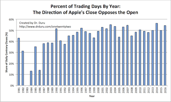
I found the error by starting from scratch and doing a completely different (and more efficient) calculation. My previous method used multiple or staged queries on the historical data collected from Yahoo Finance. My revised method used one query. The big advantage was the ease of confirming the correctness of the analysis. According to my new assessment, AAPL is much closer to 50/50 when it comes to trading in the direction of its open. Ironically enough, the share was EXACTLY 50% last year. Under these conditions the direction of AAPL’s close relative to its open has little to no relationship to the direction of the open relative to the previous trading day’s close. The chart below shows that in general 40 to 55% of the trading days on an annual basis feature closes that are contrary to the open. Much of the data on opens from the 1980s looks suspect, but I included it for completeness.

This exercise was an important lesson! I am next turning my attention to the original model that used machine learning techniques to project whether or not AAPL would close with a gain or a loss based on the previous day’s trading in the stock and the S&P 500. I am much more confident in that model given I took it through multiple iterations. I consider the model to be very robust, but it was difficult to use. To maximize effectiveness, I had to run the model right before the close of the trading day, hoping that the prices at the time were “close enough” to the actual close. After running the model, I had to assess the results and then execute the trade. I did not often have such windows of opportunity so I would try to execute right at the open the following day. AAPL’s gaps at the open would then further complicate my decision-making – not to mention the stock often races from the open and then stalls out for the rest of the trading day (this is anecdotal!). Stay tuned for the results of my updated ATM.
Currently, the “Buffett Bottom” is one of the most important drivers for AAPL’s stock. Breakouts above the 50 and 200DMAs as well as above the downtrend from last year’s triple top are the most salient features for AAPL’s outlook. However, with the primary uptrend starting to wilt and the stock market entering its most dangerous season, I think the time is right for a model to give me a different perspective on AAPL’s trading action.

Source: FreeStockCharts.com
Be careful out there!
Full disclosure: long AAPL call options
