
A recent article in Business Insider by Jesse Felder from TheFelderReport.com raised a loud alarm bell over rising margin debt levels in the U.S. stock market (see “A closely followed indicator says a 20% drop in stocks could be coming soon“). The article used the following chart as part of an analysis concluding that a massive bear market is right around the corner – specifically a correction of 20% in the S&P 500 (SPY) should occur “sometime soon”:
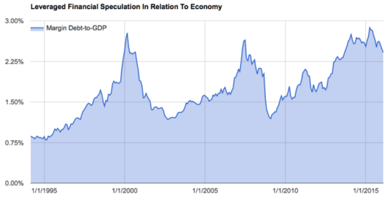
Source: Business Insider
This chart is VERY suggestive, but I see two immediate problems: 1) a very small sample size (n=2), and 2) the nature of the latest run-up is much different than the last two. The article tries to address #1 by building a model of projected 3-year returns based on the margin debt to GDP ratio.
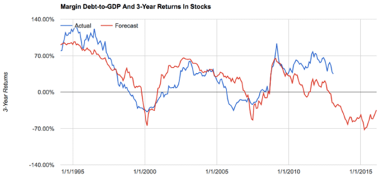
Source: Business Insider
I see two major problems with this model.
First, why just use and provide the 3-year return? Did this projection fortuitously work the best out of 100 other attempted time periods? How good is the idea on those other time periods? It is VERY possible that just by pure random luck, THIS is the one time period that provided the best fit. I would have more confidence in this model if the concept worked over multiple forecast periods.
Second, even with a good reason to believe in the robustness of this model choice, I see periods of MAJOR model failure that give me pause. See in particular (approximately), 1995 to 1997, 2006, and, interestingly enough, the entire post-recession period! A quick glance tells the eyes that the model seems to capture the general trend and contours of actual performance, but a closer examination quickly reveals very large errors between actual and forecast performance. In fact, seeing these errors convinces me that this 3-year projection was indeed chosen as one of numerous potential models that just happened to (meaning coincidentally) have the “least bad” errors.
Even putting aside the small sample size for major tops and the apparent inaccuracies in the model, I think the nature of the current margin debt run-up is VERY different than the previous two…and could even explain why the model has performed so poorly in the post-recession period. In trader lingo, the previous two run-ups in margin debt went “parabolic”: the uptrend suddenly accelerated to a presumably unsustainable pace. Not only has the latest run-up in margin debt relative to GDP remained very orderly, but the latest peak in this ratio occurred a year ago. It is VERY possible that this ratio will resume its upward trend and take the market even higher before any massive correction occurs.
There are other reasons I think that THIS time IS different:
Accommodative monetary policies across the globe
Major central banks across the globe are either still easing monetary policy or maintaining extremely accommodative policies. Even in the U.S. where the Federal Reserve has supposedly initiated rate normalization, the Fed has explained at great length and frequency that made it abundantly clear that if necessary it stands ready to add more juice to markets along with its partners around the globe. In this sense, easy money and lower and lower rates suggest that the margin debt to GDP ratio could easily go a lot higher this cycle than in previous cycles before the stock market runs out of gas.
Household deleveraging
While regular American households are not responsible for driving up margin debt, I find it instructive to note that they continue to deleverage in a process that started in earnest with the last recession. While the St. Louis Fed does not have earlier data available, we know that at least in the last bull cycle households were climbing massive debt levels thanks to refinancing and using their homes as ATMs. In other words, it is hard to describe the current era as one of uncontrolled greed when consumers are still in retreat relative to debt.
I include Germany in the chart below as an example of another Western industrial power where households are in retreat. Canada provides a spectacular contrast. The Bank of Canada has noted for years that financial imbalances are growing in its economy thanks to consumer debt, partially in the form of household debt. For example, this quote comes from its Monetary Policy Report on January, 20 2016: “While vulnerabilities in the household sector continue to edge higher, overall risks to financial stability are largely unchanged.”
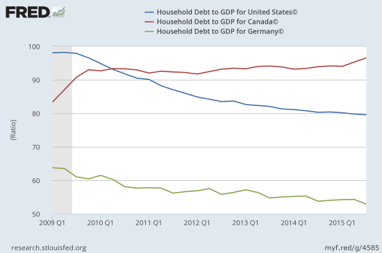
Source: International Monetary Fund, Household Debt to GDP for United States© [HDTGPDUSQ163N], retrieved from FRED, Federal Reserve Bank of St. Louis, April 7, 2016.
International Monetary Fund, Household Debt to GDP for Canada© [HDTGPDCAQ163N], retrieved from FRED, Federal Reserve Bank of St. Louis, April 7, 2016.
International Monetary Fund, Household Debt to GDP for Germany© [HDTGPDDEQ163N], retrieved from FRED, Federal Reserve Bank of St. Louis, April 6, 2016.
Nothing says retrenchment like a drain of fund flows. The following chart comes from a Bloomberg article noting that stock buybacks explain the on-going run-up in stocks (margin debt was NOT mentioned). My critique here is that rising stock markets make companies more confident and more confident companies tend to buy the dips in their stock.
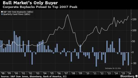
Source: Bloomberg
The small caveat to this picture of retrenchment is a chart from a different Bloomberg article showing an increasing commitment to ETFs. This particular article suggested that institutional investors and traders were increasingly using ETFs instead of futures. I also do not think that the rise of ETFs is a direct beneficiary of net fund outflows because the huge surge in fund flows in 2014 did not coincide with a drop in ETFs like it did in 2013.
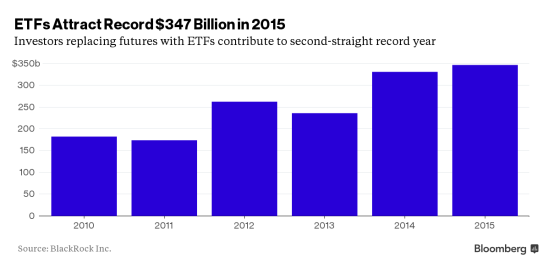
Source: Bloomberg
Currently, the technical underpinnings of the S&P 500 (SPY) are very solid as demonstrated by the on-going expansion of stocks trading above their 200-day moving averages (DMAs) and the previous rapid expansion in stocks trading above their respective 40DMAs. I explain my latest outlook in “A Nervous Market Awaits More Fed Refreshments.”
Now certainly I have not said anything that absolutely prevents a massive sell-off tomorrow, this year, or next year, etc.. I am instead pointing out the abundant caution that needs to be applied to any model that takes a single indicator and projects out causation over a very extended period of time when the case for correlation itself is not particularly strong. I will even go so far to suggest that the cause-effect starts with market strength which encourages margin debt which in turn supports further strength. Similarly, market weakness discourages margin debt which in turn further pressures markets. This process likely occurs with numerous confounding lags and leads…
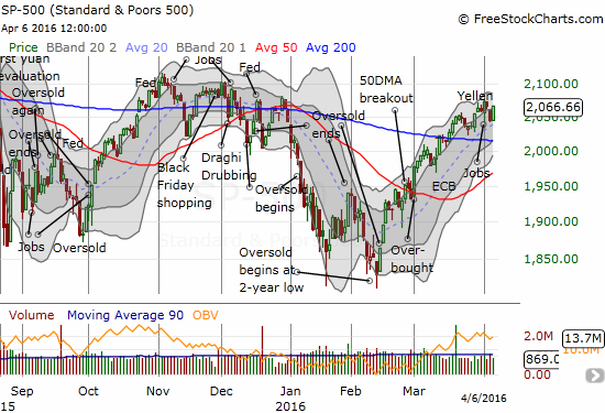
Source: FreeStockCharts.com
Be careful out there!
Full disclosure: no positions
Reminds me of the Junk Science theories where they start with a conclusion then find a model to support it.
Great point!
Perhaps the replacement of futures with ETFs is driven by near-0 interest rates available on free cash; futures’ leverage may be insufficient to compensate for their other frictions. ETFs may simply be a better deal.