Graphs depicting economic data can convey different meaning to different people. For example, several models exist to explain economic growth and the variables important for forecasting economic performance. My most recent experience with this dynamic occurred after reading John Maudlin’s latest treatise on the deflationary threat facing the global economy (free subscription required). I remain unconvinced that we will descend into a deflationary spiral, but I am also morbidly fascinated with analyses predicting just such a disaster. (Maybe I will still be ready if such a fate does manage to come our way).
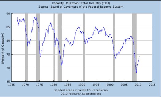
In “Some Thoughts on Deflation” (July 24, 2010), Maudlin posted a graph from the St. Louis Federal Reserve showing total capacity utilization (TCU) since 1967 (that is all the historical data available) as one piece of evidence amongst many that deflation is an imminent threat. He observed that TCU is currently at levels where past recessions bottomed.

I honestly did not quite understand Maudlin’s deflationary conclusion from this chart. Instead, I had a different reaction after seeing this chart:
- The bounce from the recent lows appears quite sharp. It shows no signs yet of flattening out or collapsing again. This is encouraging and is consistent with the last two deep recessions in the mid-70s and the mid-80s.
- I was quite surprised by the shallow nature of the TCU recovery from the last recession. It was slow and peaked at levels lower than all the past recoveries in this series.
- Related to #2, the overall trend on TCU points downward. TCU appears to suffer from a secular decline: over time, recessions have been steeper and recoveries no better than the last one and typically worse. THIS observation concerns me because it potentially implies poor prospects for long-term economic performance.
Even with the last two points, I cannot jump to the conclusion that we are suffering deflation now or tomorrow. Instead, I see a recovery still underway (as of June 1, 2010).
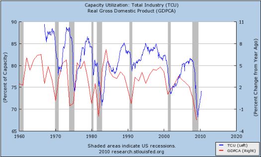
To add some more color to this picture, I created an overlay with the annual year-over-year percent change in real gross domestic product (right scale of the graph below). Unfortunately, it appears that GDP growth is also in the midst of a long-term decline. The change is much more subtle than the secular decline in TCU. The change may not even be statistically significant yet, but I am guessing that the apparent relationship between the two metrics is not a mere coincidence. (For those interested, here are the correlations based on data as of January 1 of each year in this series: same-year = 0.25, GDP change one-year lagged behind TCU = 0.61, TCU one-year lagged behind GDP change = -0.33; I expect a more granular examination will be even more useful and insightful).
I was most intrigued by the unusual and sharp disconnect between GDP growth and TCU in the final years of the last economic expansion. This suggests that a lot of unproductive and otherwise useless economic activity occurred in those years (Perhaps housing construction? Maybe securitization of sub-prime mortgages?).

While I do not see a deflationary spiral in these data, I am concerned with America’s long-term economic performance, especially when I add in the secular decline in savings rates and what looks like the start of a new generational increase in initial unemployment claims. Thus, I am reminded that our solutions must focus on structural issues. I am also left wondering about the futility of the on-going standard ideologically battles that always dominate our search for economic solutions.
Be careful out there!
Full disclosure: no positions
