
(This is an excerpt from an article I originally published on Seeking Alpha on September 8, 2015. Click here to read the entire piece.)
This piece was inspired by a model of the stock market created by Daniel Moore in Seeking Alpha titled “Dow Sends Rare Signal At The August 2015 Month-End Close.” Moore’s model uses historical data from 1957 to August, 2015 to show that a negative trailing 12-month change in the Dow Jones Industrial Average (DIA) tends to presage a “severe correction” when it closely follows an all-time high on the S&P 500 (SPY).
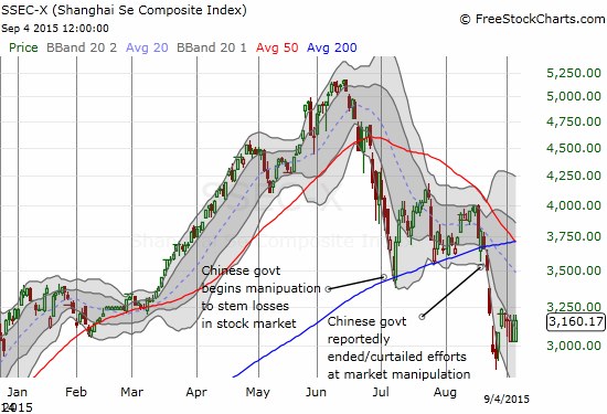
This foreboding signal takes on extra poignancy given a combination of dramatic trading events in August along with the handwringing accompanying the much anticipated decision on monetary policy from the U.S. Federal Reserve on September 17, 2015. {snip}
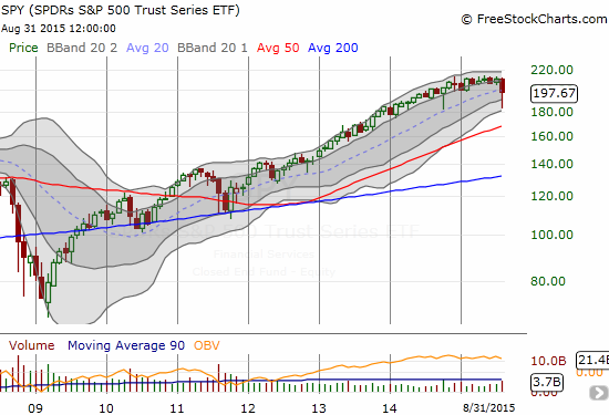
Source: FreeStockCharts.com
Moore’s model suggests that no matter what the Federal Reserve does this month, the outcome (or apparent outcome) will turn out poorly. {snip}
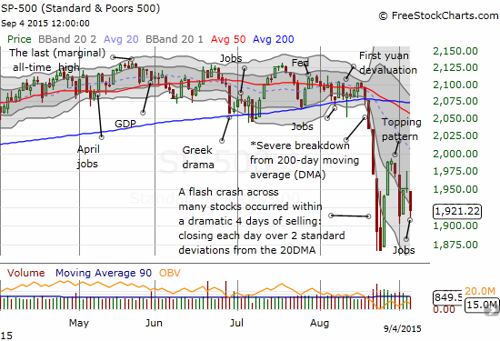
Source: FreeStockCharts.com
The S&P 500 suffered an epic breakdown in relative terms. {snip}
Moore’s model provides an interpretation of a significant loss of momentum for the S&P 500. {snip}
{snip}
With all of this swirl, it is hard to fathom a near-term positive catalyst that could put a final floor on the sell-off. Like the jobs report, anything the Fed does can receive a negative spin. This context means ANY bearish model at this point will appear appealing and convincing. However, Moore’s model is more than a well-timed bearish piece. It provides an interesting perspective for interpreting the significance and importance of moving averages as trading and investing signals.
Moore’s use of trailing 12-month changes in price is analogous to using a daily moving average. {snip}
My simplified 200-day moving average (DMA) model focuses on the S&P 500 as being sufficiently representative of the larger action in the stock market. {snip}
Before diving into my results and analysis, I propose some corrections to Moore’s data. {snip}
My model, what I will call the 200DMA post-peak correction signal, captures additional milestones. {snip}
Click to enlarge image…
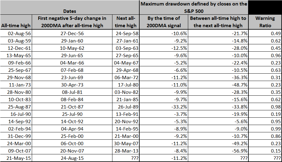
Source for price data: Yahoo!Finance. Analysis provided for review on Google drive
The “good news” from the table is that of the 17 historical occurrences of a loss of momentum following a new all-time high on the S&P 500, 12 (or 71%) came with a “significant” warning from the 200DMA signal (warning ratio at or below 0.80). {snip}
{snip}
The last 1990s were quite a volatile period when the stock market’s corrections happened quickly, violently, and the recoveries were nearly as swift. I am fascinated to see the S&P 500 has now gone 16 years without experiencing similar tumult up and down. {snip}
Today, the financial markets are surrounded by extremely active and interventionist central banks. {snip}
In the meantime, the 200DMA signal for post all-time high corrections suggests that the market’s angst will continue to careen into that meeting. If the Fed’s own analysts are on the case, they are surely looking at the same data the rest of us are reviewing. Those analysts are assessing the likelihood the market’s correction will lengthen and steepen based on the ways i’s are dotted and t’s are crossed in the statement. Chair Janet Yellen will need the coaching of a lifetime for her press conference.
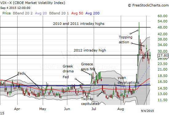
Source: FreeStockCharts.com
(I have posted the spreadsheet including my formulas for readers to review, cross-reference, and audit. Feedback, additions, suggestions for future analysis, and corrections welcome!)
Be careful out there!
Full disclosure: long SSO shares and call options
(This is an excerpt from an article I originally published on Seeking Alpha on September 8, 2015. Click here to read the entire piece.)