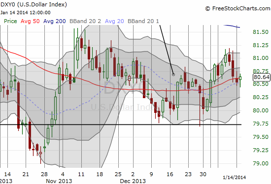
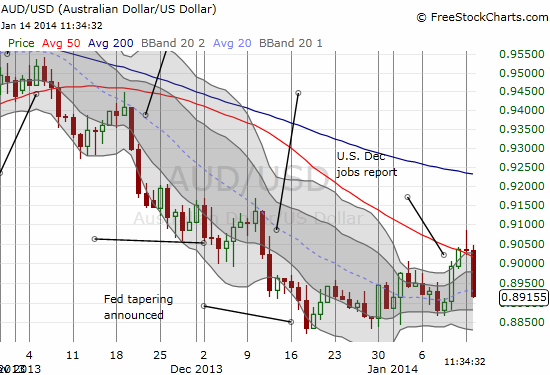
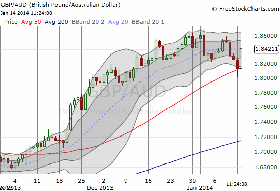
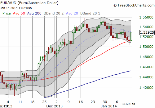
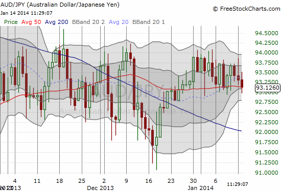
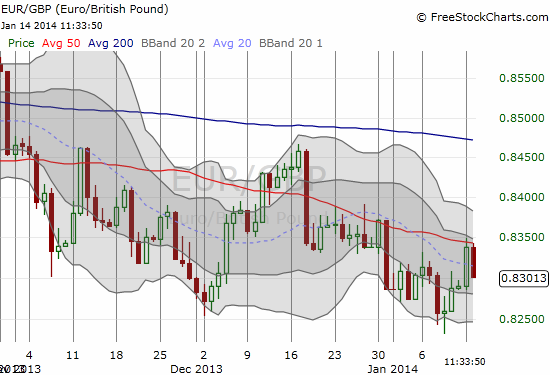
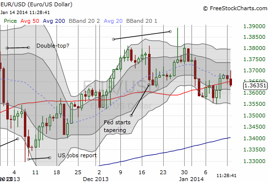
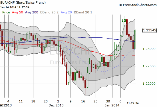
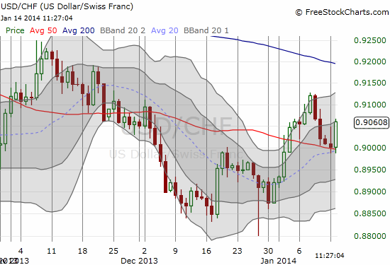
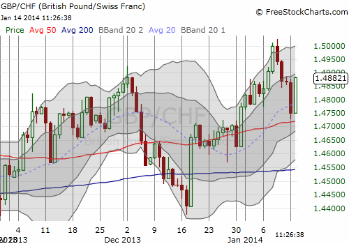
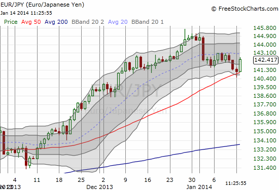
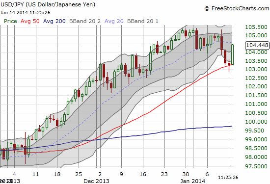
Tonight, January 14, 2014, I was casually doing my periodic check of forex charts and was absolutely startled to see so many currency pairs pivoting around the 50-day moving average (DMA). I was so captured by this pattern, I decided to post every single chart for the record. I realize that the tests and touches of key technical points are a bit squishy since currencies trade all day and night (my charts are based on Eastern time, New York – I believe most traders do the same). Still, I think this (coincidental?) pattern is worth mention. I honestly do not know what to make of it yet. Perhaps someday soon we will look back and call this a major turning and testing point for many of these currency pairs.
I am posting all the charts with little commentary because I think they speak for themselves. Each chart covers the same period of time. I also left a light watermark for easier differentiation amongst the charts. The red line marks the 50DMA; a blue line shows the 200DMA.

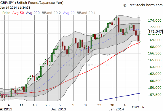
Source: FreeStockCharts.com
Be careful out there!
Full disclosure: net short euro, long pound, short Australian dollar (slight), long U.S. dollar, short Japanese yen, short Swiss franc

1 thought on “Forex Chart Review: The Power of 50 – Carving Out A Large Swath Of Key Pivots?”