(T2108 measures the percentage of stocks trading above their respective 40-day moving averages [DMAs]. It helps to identify extremes in market sentiment that are highly likely to reverse. To learn more about it, see my T2108 Resource Page. You can follow real-time T2108 commentary on twitter using the #T2108 hashtag. T2108-related trades and other trades are posted on twitter using the #120trade hashtag)
T2108 Status: 83.6% (17th overbought day)
VIX Status: 12.9
General (Short-term) Trading Call: Initiate small short position if holding none already, sell some longs.
Reference Charts (click for view of last 6 months from Stockcharts.com):
S&P 500 or SPY
SDS (ProShares UltraShort S&P500)
U.S. Dollar Index (volatility index)
VIX (volatility index)
VXX (iPath S&P 500 VIX Short-Term Futures ETN)
EWG (iShares MSCI Germany Index Fund)
CAT (Caterpillar)
Commentary
On Thursday, I tweeted that I “had to” reload on some SSO puts as the S&P 500 touched 1500. I also sold my latest round of VXX puts. It looked like fortuitous timing as the S&P 500 pulled back on the day from that psychologically important round number. However, on Friday, the market went back to grinding higher and this time closed at the high of the day and a fresh 5+ year high at 1502.96.
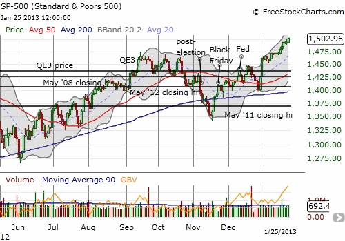
T2108 has gone nowhere as the S&P 500 keeps grinding higher. It has bounced in a very narrow range between 80 and 86% for most of this overbought period. It signals to me that no new stocks are joining the fun and the same stocks are getting more and more stretched. Adding to the warnings of extreme overbought conditions is the historic 8-day run of daily gains for the S&P 500. According to Bespoke Investments, the last time this happened was a 9-day run in 2004! There were 2 8-day winning streaks in 2003. And the next earliest one from there? 1997. In other words, the S&P 500 is trading in rarefied air. The S&P 500 is now up 5.4% for the year after just 17 trading days. 2012 also started with an extended overbought period. By this time last year, the S&P 500 was up 4.8%. The similarities are uncanny, but there is one HUGE difference between now and then. Apple (AAPL) is NOT participating in the run-up.
I will cover AAPL in more depth in another post (in the meantime, you can always check my archives for my latest commentary). Here, I just want to point out the irony of having the world’s most loved, largest, most exciting stock just 4+ months ago sinking so much off its all-time highs that it has almost wiped out all of 2012’s hard fought gains. The stock is now hovering just over my $432 downside target, the 2012 breakout point, thanks to a disastrously received earnings announcement. The irony knows no bounds as Apple had one of its worst one-day performances ever (the drop of 12.4% ranks #16 all-time) and its worst one-day post-earnings performance (the previous record post-earnings drop of 7.1% in October, 2088 is nowhere close!) reporting earnings for a quarter where the company introduced its highest number of new products ever. AAPL is down a whopping 17.3% for the year, down 37.3% since its all-time closing high in September. AAPL is still up 8.6% since the close of 2011, but the S&P 500’s performance is more than double that over the same time period at 19.5%.
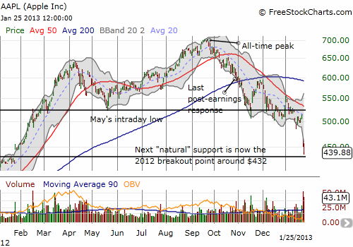
No matter what you think about AAPL or the S&P 500, this sharp divergence in performance is certainly not a good thing, and is most likely a very bad sign.
Two more warnings to go.
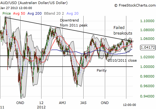
The Australian dollar versus the U.S. dollar definitively failed at resistance from the downtrend drawn from the all-time high in 2011. AUD/USD (or FXA) has now fallen for four straight days from that resistance, touching 1.04 briefly on Friday and breaking through the 50DMA on Thursday. I still have every reason to believe that AUD/USD is a leading indicator of the performance of the S&P 500. I have written past pieces on this relationship. The last one prematurely declared the return of convergence, but at least I remained bearish even as AUD/USD briefly broke through the downtrend. I now need to more carefully examine what is happening with the correlation between the Australian dollar and the S&P 500. Yet one more post I need to write! (As I type the Aussie has traded back down to 1.04 versus the U.S. dollar).
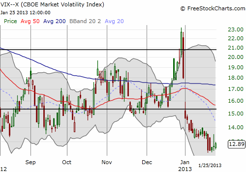
Lastly, the VIX, the volatility index, finally stopped going down even as the S&P 500 ground upward. The VIX held its low for the week and even registered slight gains the last two days. This is a small “victory” for the VIX but considering the growing optimism that is following price action, it is important to watch. The VIX is trading well below its presumed support around 15 and is at 5 1/2 year lows. In a relative sense, the VIX is probably more oversold than the S&P 500 is overbought.
I conclude with a key quote from a NY Times article heralding the return of small investors who are feeling more comforted by the apparent dissipation of risks in the market. The main storyline since the 2009 lows has been the consistent exodus of retail investors from the stock market; an exodus that actually began near the last peak in 2007 and has transferred historic amounts of money from stocks to bonds. I mention this timing to caution readers that it would be far too simplistic to assume that because retail investors are finally rushing in that their buying must be a contrarian indicator.
This may all come down to what happens in bonds. If enough investors cash out of bonds to buy stocks, we could indeed launch a new phase of this bull market that could move quite swiftly (I am long puts on TLT, the iShares Barclays 20+ Year Treasury Bond Fund). If instead, investors are simply shifting the allocation of new funds toward stocks and away from bonds, we may see a very muted impact in both markets. This possibility struck home for me when a friend asked for my advice on Friday a bit distraught because her entire retirement portfolio has been sitting in all cash for years now. (My advice was to wait for the next sell-off in the market that is sure to come and begin investing a bit at THAT time).
Regardless, plenty of hungry hedge funds are sure to interpret this move as contrarian, and we should see the weakest stocks face increased pressure from sellers and shorts alike (not good for AAPL in the short-term!). Here is the key quote from the NY Times in “As Worries Ebb, Small Investors Propel Markets“:
“There is no surefire data to use to gauge the behavior of retail investors. Some of those who left stock-focused mutual funds in recent years have put the money instead into specific stocks or exchange-traded funds, which hold baskets of stocks. But analysts agree that most indicators point to rising confidence in the market.
The level of bullishness among small investors has nearly doubled just since mid-November, according to a weekly survey conducted by the American Association of Individual Investors.
In the last three weeks, the market data company Lipper reported that $14.9 billion had gone into all stock-focused mutual funds, the most in any three-week period since 2001. Mutual funds focused specifically on American stocks have collected $6.8 billion since the new year, the most in all but one comparable period since the financial crisis.
This comes after investors had removed $416 billion from stock-focused mutual funds since the start of the financial crisis, according to Lipper. Those outflows continued even as the market climbed over the last few years.”
Daily T2108 vs the S&P 500
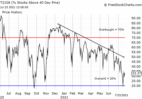
Black line: T2108 (measured on the right); Green line: S&P 500 (for comparative purposes)
Red line: T2108 Overbought (70%); Blue line: T2108 Oversold (20%)
Weekly T2108
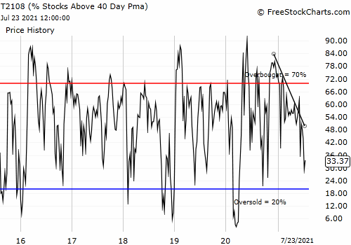
*All charts created using freestockcharts.com unless otherwise stated
Related links:
The T2108 Resource Page
Expanded daily chart of T2108 versus the S&P 500
Expanded weekly chart of T2108
Be careful out there!
Full disclosure: long VXX shares, long AAPL shares and call spread, long SSO puts, long TLT puts
