(This is an excerpt from an article I originally published on Seeking Alpha on March 14, 2012. Click here to read the entire piece.)
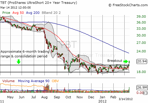
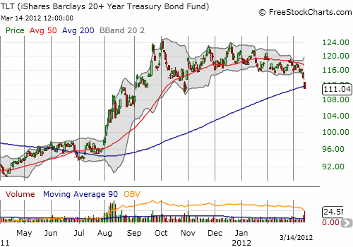
For the past few years, trying to call a top in Treasurys has been a fool’s game. From the manipulation of the Federal Reserve to fears of deflation to fears of global calamities, U.S. government debt has served as the reliable “go-to” rock under which to hide. The strong rally in stocks that has taken the S&P 500 (SPY) to new multi-year highs has surprisingly featured little reaction in bonds…until now.
{snip}


Source: FreeStockCharts.com
The forces that continue to prop up U.S. government debt and keep yields low are strong. For example, on February 2, 2012, Doug Kass recently cited the following statistics about the continued flight from stocks to bonds in 2011…{snip}
At the time I originally quoted these data, I noted how fascinated I was by the alacrity of individual investors in this cycle. {snip} …
Be careful out there!
(This is an excerpt from an article I originally published on Seeking Alpha on March 14, 2012. Click here to read the entire piece.)
Full disclosure: long TBT and short TBT puts
