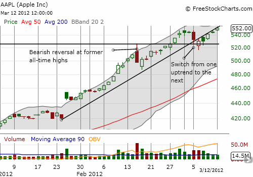
Apple, Inc. (AAPL) is now up an incredible 36% for the year. Even more incredible, the stock has spent much of the year rallying in nearly straight lines, straight up. This rally has been so powerful that even the major bearish reversal in mid-February looks like a blip well-contained within a strong uptrend. The small “sell on the news” after Apple’s latest product announcements (iPad and Apple TV) now looks like a mere dividing line between two sharp upward trend lines. I am guessing it is not a coincidence that the shift from one trend to the next occurred right around the former intra-day high set by the bearish reversal day.
Overall, I think the recent daily chart speaks volumes for Apple.

Source: FreeStockCharts.com
Apple shareholders are now back in a happy place. That is, almost everyone holding a share is sitting on at least a penny of profit. The persistently strong buying volume despite the few strong selling days continues to suggest Apple is built to last for a while. With AAPL’s average trading volume at 1/3 of PowerShares QQQ Trust (QQQ) and 10% of SPDR S&P 500 (SPY) I cannot help but wonder whether the movement of money from lower-priced shares of other stocks to the high-priced shares of Apple is at least partially responsible for the poor buying volumes on the major indices. Hmmmm….
Be careful out there!
Full disclosure: no positions
