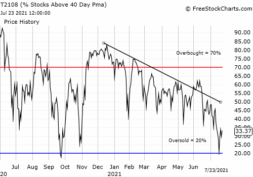
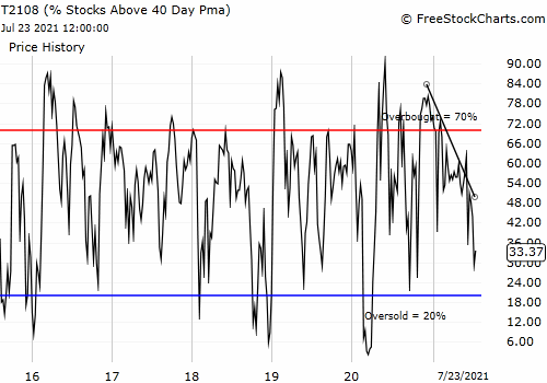
(T2108 measures the percentage of stocks trading above their respective 40-day moving averages [DMAs]. To learn more about it, see my T2108 Resource Page. You can follow real-time T2108 commentary on twitter using the #T2108 hashtag. T2108-related trades and other trades are posted on twitter using the #120trade hashtag)
T2108 Status: 47%
VIX Status: 23
General (Short-term) Trading Call: Hold
Commentary
T2108 continues its bounce between extreme levels. It closed at 47% after dropping to 30% the previous day (Monday). On that day, I closed out my most recent SDS position representing 40% of my total position (trade was tweeted). I was of course relieved after the S&P 500 soared 3.0% and sliced right through the 50DMA overhead resistance. This move completely invalidated the bearish pattern that was forming with two failed tests of the 50DMA followed by a correction to new December lows.
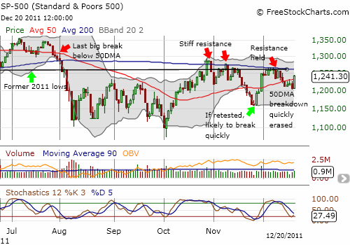
Note that stochastics are turning up from oversold conditions and support further upside for the S&P 500 for at least another day.
Tuesday’s rally marks the third time in one month in which the S&P 500 experienced a sharp rally and recovery BEFORE T2108 hit oversold levels (at or below 20%). In 2010, the S&P 500 tended to rally after T2108 hit about 30%. It is certainly possible this pattern is developing again. If so, it makes sense for more aggressive (or bullishly inclined) traders to initiate small positions whenever T2108 hits 30% or lower and then get more aggressive with the standard T2108 rules once the indicator becomes oversold. Note well I am NOT changing the definition of oversold; I am only noting a potential rule change for more aggressive traders who do not want to miss potential quick (one or two-day) upside opportunities.
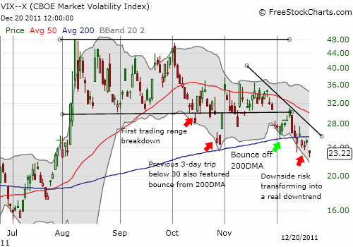
The VIX looks like it is FINALLY breaking down. The chart below suggests that the VIX is breaking down below the former trading range into a short-term downtrend. A reduction in volatility supports a more bullish outlook.
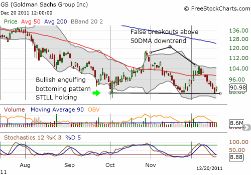
Even Goldman Sachs (GS) held firm at its bottom. I tweeted on Tuesday that GS was fading right from its gap up open. The implication was supposed to be bearish for the market. However, after it seemed GS had stabilized, I closed out my put spread (also tweeted). The timing was fortuitous since GS rallied for the rest of the day as the general stock market held firm and even rallied into the close.
Finally, it seems the stock market may finally be ready to decouple from the euro. Soon after the U.S. market open I tweeted the following: “As is often the case, the biggest #forex moves happen UP TO the U.S. open. Need another pop to support stock rally. Caution. $USD”. I even closed out bullish positions in the Australian dollar and the Canadian dollar to return to a net long U.S. dollar position. Sure enough, the U.S. dollar index held its ground after the open. The euro then slid sharply after European markets closed for trading. I thought that was the precursor for a weakening stock market. Instead, the S&P 500 continued its slow and steady creep throughout the day.
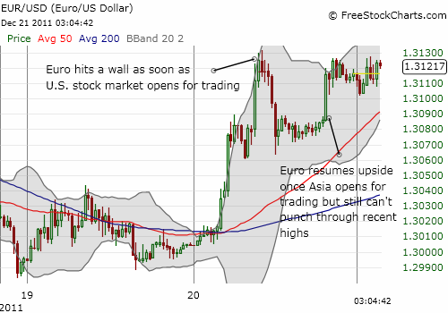
While the bias is tilting back toward the bulls here, I still think the market is throwing mixed signals. Overhead resistance still looks ominous. It must break to give the bulls a firmer case. Bears are also far from confirming their case. The end result is a market still trading in limbo that provides only the quickest of trading opportunities.
Charts below are the latest snapshots of T2108 (and the S&P 500)
Refresh browser if the charts are the same as the last T2108 update.
Black line: T2108 (measured on the right); Green line: S&P 500 (for comparative purposes)
Weekly T2108
*All charts created using freestockcharts.com unless otherwise stated
Related links:
The T2108 Resource Page
Expanded daily chart of T2108 versus the S&P 500
Expanded weekly chart of T2108
Be careful out there!
Full disclosure: long SDS and VXX; long VXX calls; net long U.S. dollar; net short euro, long GS shares

