
(T2108 measures the percentage of stocks trading above their respective 40-day moving averages [DMAs]. It helps to identify extremes in market sentiment that are likely to reverse. To learn more about it, see my T2108 Resource Page. You can follow real-time T2108 commentary on twitter using the #T2108 hashtag. T2108-related trades and other trades are posted on twitter using the #120trade hashtag)
T2108 Status: 66.7%
VIX Status: 12.4
General (Short-term) Trading Call: Short (bearish bias).
Active T2108 periods: Day #136 over 20%, Day #11 over 60% (overperiod), Day #51 under 70%
Reference Charts (click for view of last 6 months from Stockcharts.com):
S&P 500 or SPY
SDS (ProShares UltraShort S&P500)
U.S. Dollar Index (volatility index)
EEM (iShares MSCI Emerging Markets)
VIX (volatility index)
VXX (iPath S&P 500 VIX Short-Term Futures ETN)
EWG (iShares MSCI Germany Index Fund)
CAT (Caterpillar).
Commentary
The S&P 500 (SPY) sagged fractionally as it failed to follow-through to a breakout move and overbought conditions. T2108 edged off the overbought boundary (70%) to close at 66.7%. So, the suspense drags on and resolution continues to elude the market: an extended overbought rally or a notable pullback.
I have not examined the historical data on the underperiods and overperiods in a long while. The T2108 20% overperiod appears to be the most telling. The chart below shows at least two interesting points at this juncture in the overperiod.
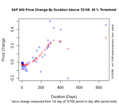
The 20% overpriod is now 136 days old; T2108 was last oversold on June 25, 2013. There is a gap in this range of duration after which the S&P 500’s performance starts to soar. The S&P 500 is up 15.8% since it was last oversold. This is FAR above the performance we should expect if the 20% overperiod ended today. The implication is either 1) this overperiod is going to last a lot longer and/or 2) a return to oversold conditions will wipe out the majority of the gains made since June. Condition #2 is consistent with the idea that a 10% correction in the market is long overdue. I interpret these possibilities as defining an important juncture in the market here.
The chart on the 70% underperiod is also informative.
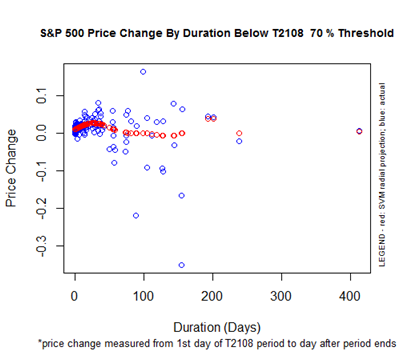
At 51 days in duration, the 70% underperiod is now reaching a juncture where its end should coincide with flat performance on the S&P 500. T2108 was last overbought on October 30, 2013. The S&P 500 is up 4.3% since then. Again, the S&P 500 is far out-performing expectations, BUT there is a wide range of historical performance that includes today’s conditions. On balance, it seems likely that the next overbought level will occur at levels lower than the current one. This again suggests a steep pullback is awaiting the market.
Finally, the 60% overperiod does not provide much info to me right now.
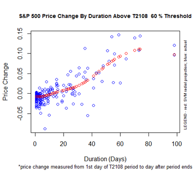
The 60% overperiod has dragged on since January 3rd, so almost the entire, young trading year. The market’s nearly flat performance since then is quite consistent with the chart above. If this lasts 10 days more or so, it seems the market will finally gain a few percentage points.
Now, on to some stock charts. You readers may have noticed I have increased my routine of chart reviews. I have found many valuable nuggets in what I am calling “whiplash charts.” While the market is being friendly to technical chart-reading, I want to take advantage as best as I can. In this series of charts, I include some important follow-ups and one new set-ups.
First honors go again to Apple (AAPL).
On Friday, AAPL made a VERY disappointing plunge past its 50DMA in a form of lagged whiplash from the earlier rally. Readers know that in the last T2108 Update, I came into the day prepared with puts. The Apple Trading Model (ATM) predicted an up day for Thursday; it was an unstable prediction that turned out incorrect. The correct call for Friday more than made up for it. I surely did not expect AAPL to close below the important support of the 50DMA; in fact, I thought the “sloppy retest” had ended, sending AAPL into the “open field.” Instead, I am back to wondering whether the top of the January, 2013 earnings gap down will get retested before this month’s earnings.
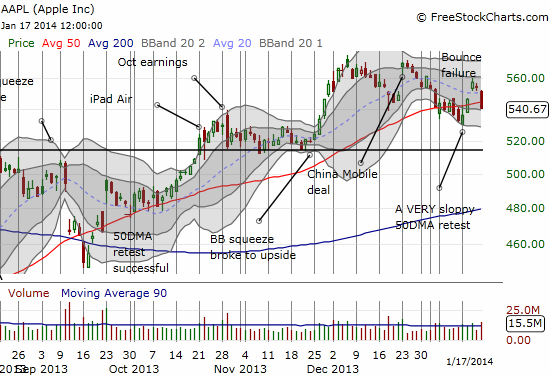
I did not generate a prediction for Tuesday’s trading given the holiday on Monday. On technicals alone, the bias is definitively bearish with at least a retest of January lows around $530 in the cards for the week.
LinkedIn (LNKD) produced some substantial whiplash the last two days. This pattern has created perfect bookends with the sudden bullish engulfing pattern the saved LNKD in from a 200DMA breakdown matched with the sudden reversal of the breakout over the 50DMA. LNKD jumped an amazing 6.7% on Thursday on what I think was news that LNKD in is “ready” to enter the Chinese market. The move in the stock on such news seemed wildly optimistic to me given the difficult road likely ahead for LNKD with this move. With a call option backing me up as a hedge, I added one more tranche to my growing short position. It was tough to sit on the massive gains on that call option (perhaps I should have rolled to a higher strike!), but I decided to hold it in case the intensity of buying somehow spilled into subsequent days.
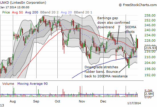
Note that once again, a rush past the upper-Bollinger Band (BB) faded. LNKD now rests perfectly on its 50DMA. This setup would normally mark a trading point based on the strength off support with a tight stop. However, as I pointed out at the start of LNKD’s latest burst higher, the recent history shows that the stock’s momentum and enthusiasm has consistently ended with the stock punching above 50DMA resistance. This latest move is looking like history repeating itself.
In a chart review in the January 7th T2108 Update, I pointed out that Best Buy (BBY) had printed a classic topping pattern. The absolute collapse of the stock on Thursday’s earnings warning is a powerful testament to the power of these kinds of topping patterns. Unfortunately, I closed out my short just days before the warning: it seemed BBY was getting ready for a relief rally. Instead of being overly clever with my positioning and over-managing the trade, I should have just braced myself and/or bought call options as a small hedge – after all, I had been holding onto this short position since around October! It was a fade of the post-earnings rally that took a few months to play out.
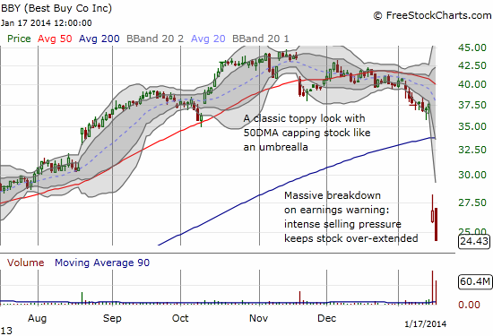
BBY is also an interesting example of how the narrative can often mean much more than the true fundamentals of the business. It was just a little over a year ago, Christmas season 2012, when all the talk was about how BBY was essentially on the verge of following its competitors into bankruptcy. There was non-stop chatter about Amazon.com (AMZN) and the common use of big box stores as showrooms for online shopping. Even the attractive buyout offer of BBY’s founder and former CEO could not save the stock from hitting $11.29 on December 29th, 2012. Fast forward to a monster 236.5% gain for 2013 and all appeared well again: no talk of on-line competition, lots of hope for margin improvements (nevermind aggressive pricing to compete with online retail), and dreams of strong holiday sales. Last week’s collapse has brought all the old talk back. I am guessing through it all, almost nothing has fundamentally changed about BBY’s business.
Now, with the stock at $24.43, 35.0% off where it traded just two days earlier, and well below the lower-BB, I was compelled to take the other trade. I first sold a March put option to grab some fear premium (which was amazingly lower than I expected!) and for good measure bought a Jan, 2015 call spread. My basic guess is that the old narrative survives and will generate at least one relief rally in the coming months. BBY’s warning sure caught a lot of analysts napping: according to Schaeffer’s Investment Research as of Friday, January 16th, the rating tally lists as 12 strong buys, 1 buy, 5 holds, 0 sells, and 1 strong sell….yikes.
Speaking of classic shorts, Whole Foods Market (WFM) has printed almost the exact same pattern as BBY over the exact same timeframe. The main difference is that WFM has failed two critical tests of resistance, the 50DMA AND the 200DMA.
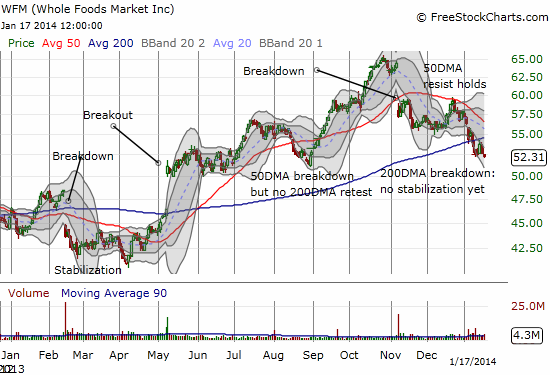
I am much more cautious on WFM as a short because it is a VERY popular place to shop, has a strong business model, and has high profitability. Even the forward P/E does not strike me as exorbitantly high. It is definitely high at 26, but, hey, this is a premium store. Shorts are starting to get on board, but the trade is not yet crowded. Shares short are only 3% of float as of December 31st, rising sharply since the stock last took off in April/May.
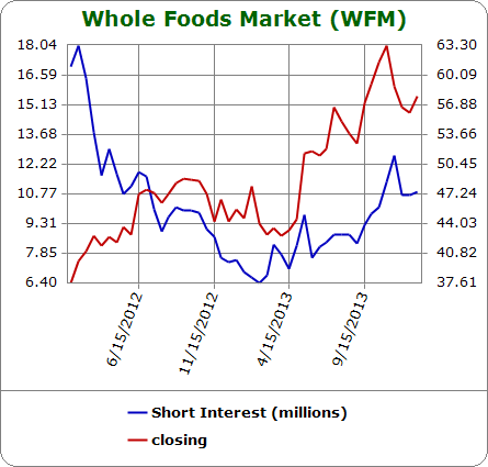
Source: Schaeffer’s Investment Research
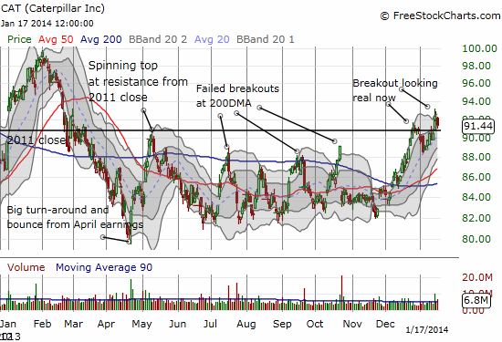
Finally, an update on Caterpillar (CAT). The stock looks like it is finally following-through on a sustained breakout. This is a huge positive for the market (although my bias for the overall market remains the SAME at bearish). I cannot imagine the general stock market selling off while CAT is going in the opposite direction. The straightforward (swing) trade here is to buy above the breakout and stop out below the breakout (around $90.80).
Daily T2108 vs the S&P 500
")
Black line: T2108 (measured on the right); Green line: S&P 500 (for comparative purposes)
Red line: T2108 Overbought (70%); Blue line: T2108 Oversold (20%)
Weekly T2108

*All charts created using freestockcharts.com unless otherwise stated
Related links:
The T2108 Resource Page
Expanded daily chart of T2108 versus the S&P 500
Expanded weekly chart of T2108
Be careful out there!
Full disclosure: long SPHB and SPLV and SSO puts (pairs trade), long AAPL shares, long CAT, long BBY call spread and short put