
(T2108 measures the percentage of stocks trading above their respective 40-day moving averages [DMAs]. It helps to identify extremes in market sentiment that are highly likely to reverse. To learn more about it, see my T2108 Resource Page. You can follow real-time T2108 commentary on twitter using the #T2108 hashtag. T2108-related trades and other trades are posted on twitter using the #120trade hashtag)
T2108 Status: 67.9%
VIX Status: 15.7
General (Short-term) Trading Call: Hold
Reference Charts (click for view of last 6 months from Stockcharts.com):
S&P 500 or SPY
SDS (ProShares UltraShort S&P500)
U.S. Dollar Index (volatility index)
VIX (volatility index)
VXX (iPath S&P 500 VIX Short-Term Futures ETN)
EWG (iShares MSCI Germany Index Fund)
CAT (Caterpillar)
Commentary
As T2108 meanders just outside overbought territory, a wedge is forming on the S&P 500.

This is a market waiting for its next catalyst. I am expecting whatever that is will send the index sharply shooting up or down out of the wedge. There are plenty of possibilities down the road: Friday’s labor report, anything under the sun in Europe, October earnings, etc… so brace yourselves.
Until this wedge breaks and/or T2108 returns to an extreme, there is not much to report. However, I will use this opportunity to present a few charts of interest and quick commentary. They represent a mixed bag of bullish and bearish indicators.
Apple (AAPL)
Today, AAPL finally broke down below the critical $660 support line. As expected (I tweeted on this), this put the 50DMA into play. AAPL headed straight for that support line, and – surprise, surprise – the stock bounced with pinpoint precision. AAPL even closed the day above $660 again – further acknowledging the importance of this level. I zoomed in with the chart below just to make this action clear. Although the bounce from support is encouraging, AAPL seems to be in an increasingly precarious position. The 50DMA seems certain to break soon as AAPL continues trending down from all-time highs.

Note well that I am eagerly anticipating AAPL earnings this month. Faithful readers may recall that there are some strong correlations to potentially play with AAPL earnings in October. In particular, if AAPL is selling off for the two weeks going into earnings, the odds will favor a nice, post-earnings turn-around. For more details see “The Odds Deliver As Post-Earnings Apple Breaks April’s Downtrend.”
Yelp.com (YELP)
YELP remains a fascinating stock. I have written several times about how it has repeatedly and reliably failed at resistance formed from its closing high. The stock has now churned for almost a month with a very slight upward bias that has taken the stock ever closer to resistance. This is a much different behavior than other tests, and I still contend that this means the odds favor a big breakout to the upside now – the puts that I paid for with a calendar spread are worthless at this point. Note in the chart below how YELP is getting increasingly wedged between resistance and its 20DMA. A breakout is likely around the corner, within a week even.

Cerner Corp (CERN)
CERN is a software company serving the healthcare space. It stands to benefit from healthcare reforms that seek to reduce costs and increase efficiency and convenience. The stock has remained on a strong, long-term uptrend. Although I have followed the stock periodically, I am just now noticing the amazingly loud technical signals. CERN broke out in the summer of 2005, peaked in 2007, and, when the financial crisis hit, CERN successfully retested support from the breakout point. CERN has paused only for brief rests ever since. Currently, the stock is pushing through another breakout, this time above its 50 and 200DMAs.


J.C. Penney Company Inc (JCP)
JCP has been a wild stock. While JCP bottomed for the year about 6 weeks after the S&P 500 did, the stock quickly gained 50% from there in exactly two months. This move climaxed the day of an investor’s webcast with a huge run-up above the 200DMA that filled the gap down from May 16, only to completely fade by the close: a double-whammy of a classic warning sign (that I did NOT trade!). JCP gained 12% in one day and lost it all on the same day. The follow-up trading the next day continued the disaster, taking the stock quickly down to the 50DMA. On Tuesday, October 2, JCP finally broke that support on an increase in trading volume. This move is ominous and suggests much more downside to come.

As always, earnings news trumps technicals. However charts like these continue to tell me that the overall market is a very mixed bag of tricks. I prefer to stay relatively neutral in the short-term, looking for very unique opportunities to trade. If/once T2108 returns to overbought territory, I will NOT re-establish the aggressive overbought strategy until after the market proves its bullish underpinnings with new 52-week highs. I will not get fully bearish until the uptrend from the June lows finally breaks.
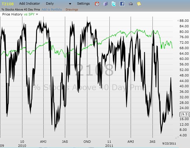
Daily T2108 vs the S&P 500
Click chart for extended view with S&P 500 fully scaled vertically (updated at least once a week)
")
Black line: T2108 (measured on the right); Green line: S&P 500 (for comparative purposes)
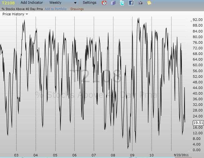
Weekly T2108

*All charts created using freestockcharts.com unless otherwise stated
Related links:
The T2108 Resource Page
Expanded daily chart of T2108 versus the S&P 500
Expanded weekly chart of T2108
Be careful out there!
Full disclosure: long SSO and AAPL calls, long YELP puts