
(T2108 measures the percentage of stocks trading above their respective 40-day moving averages [DMAs]. To learn more about it, see my T2108 Resource Page. You can follow real-time T2108 commentary on twitter using the #T2108 hashtag. T2108-related trades and other trades are posted on twitter using the #120trade hashtag)
T2108 Status: 71% (overbought day #42)
VIX Status: 17.2
General (Short-term) Trading Call: Close more bullish positions. Begin but do NOT expand an existing bearish position.
Reference Charts (click for view of last 6 months from Stockcharts.com):
S&P 500 or SPY
SDS (ProShares UltraShort S&P500)
U.S. Dollar Index (volatility index)
VIX (volatility index)
VXX (iPath S&P 500 VIX Short-Term Futures ETN)
EWG (iShares MSCI Germany Index Fund)
Commentary
All signals continue to point to the long overdue end to this historic overbought period. T2108 plunged to 71%. For such a long overbought period, I could even argue that this is “close enough” to the end. However, the S&P 500 has barely budged so such a declaration would seem a bit “empty” here.
In my last update of February, I provided a reminder of the signals that pointed to this end. Friday’s plunge to 71% was surprising only in contrast to the fractional change in the S&P 500. The chart below reminds us that the index is still pushing through stiff resistance. The current “breakout” to multi-year highs remains very marginal.
 highs")
The main bright spot for bulls is that Friday’s selling did not make a new low for the week and featured low volume. Not to mention the current uptrend is well intact. However, without T2108 we may not have even noticed the waning momentum (remember, T2108 measures ALL NYSE stocks). Think about it this way – the strongest stocks remain strong (think stocks like Caterpillar, Apple, IBM, and even Intel) while the most marginal participants in the rally have finally succumbed to waning buying interest. The next key is the length of time the steadily thinning ranks of leaders can continue to prop up the major indices. While the S&P 100 shows little difference from the S&P 500, a fissure has appeared in small cap stocks. The iShares Russell 2000 Index Fund ETF (IWM) went nowhere throughout most of February and is now approaching February’s lows (kudos to Doug Kass for pointing this out). However, the iShares Russell 1000 Index Fund ETF (IWB) RALLIED through most of February and is as strong as ever. Your perspective on the health of this rally completely changes depending on where you look!


Note well that I have not spent much time studying small cap stocks in any systematic way, so I cannot say whether there is any historical data to suggest that this divergence between IWM and IWB means much. This divergence DOES seem to support the notion that T2108 is exposing the first real weakness in the current rally.
I conclude with a reminder of caution. The end of this overbought period does NOT mean that a bear market is about to erupt. The historical record suggests that the largest pullback we can expect is about 7-8%. Such a sell-off is just as likely to occur as a more modest 1-2% drop. This overbought period ranks #7 in duration since 1986. All of the top ranked overbought periods were part of larger, on-going rallies. Only in 1987, did a major sell-off eventually erupt…and that crash was in itself a rare event. Here is my casual description of what happened following the end of each of the top six overbought periods. The links go to snapshots of the related periods:
- 1987: correction, new rally, and then crash
- 1991, 2003: drift upward (rally just slowed down)
- 1997: correction, new highs, major sell-off, new highs again
- 2009, 2010: correction before resumption of persistent rally
For now, I am guessing this cycle is more like 2009 and 2010 than the others.
Charts below are the latest snapshots of T2108 (and the S&P 500)
Refresh browser if the charts are the same as the last T2108 update.
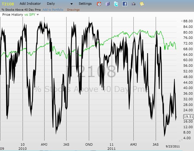
Daily T2108 vs the S&P 500
")
Black line: T2108 (measured on the right); Green line: S&P 500 (for comparative purposes)
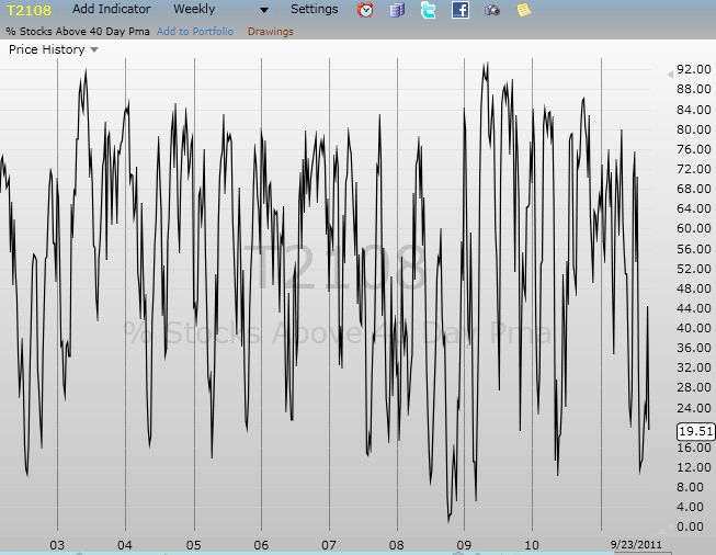
Weekly T2108

*All charts created using freestockcharts.com unless otherwise stated
Related links:
The T2108 Resource Page
Expanded daily chart of T2108 versus the S&P 500
Expanded weekly chart of T2108
Be careful out there!
Full disclosure: long SDS and VXX; long VXX puts
Although the cap-weighted S&P 500 has barely budged, the equal-weighted S&P 500 is stuck in a trading range:
http://stockcharts.com/h-sc/ui?s=RSP&p=D&yr=0&mn=6&dy=0&id=p09867326492
When you compare the equal-weighted S&P 500 to the cap-weighted S&P 500, you can see quite a recent drop, almost reminiscent to July 2011 when RSP:SPY dropped quite a bit even though the S&P 500 was in a trading range:
http://stockcharts.com/h-sc/ui?s=RSP:SPY&p=D&yr=1&mn=0&dy=0&id=p97101097263
Although the Russell 1000 has rallied, the Russell 1000 cumulative advance/decline line (T2127) has been stuck in a trading range.
As to the Russell 2000, take a look at its cumulative advance/decline line (T2128) and you’ll see a massive drop (!!).
Meanwhile, sentiments are getting pretty extreme:
http://blogs.decisionpoint.com/chart_spotlight/2012/03/rydex-asset-levels-are-bearish.html
Seems like a catalyst is needed to get things moving…
That is one massive drop in T2128! Thanks for pointing that out. I typically only look at T2108 and sometimes T2107.
I didn’t realize anyone had built an indicator off Rydex asset levels, but I am wondering how they know money market levels? Anyway, those extremes definitely suggest the pool of new money is running out, but I wonder how we reconcile these numbers with other stats that suggest retail investors continue to cash in stocks and buy up bonds?
You are truly a king of technical indicators!
McClellan says that Rydex publishes the data here:
http://www.rydex-sgi.com/products/mutual_funds/info/navs.rails
It seems that many market analysts follow this data, for example:
http://sentimentrader.com/blog/archives/135
http://www.thetechnicaltake.com/2012/02/25/investor-sentiment-what-is-your-plan/
http://www.mcoscillator.com/learning_center/weekly_chart/rydex_assets_levels_show_investor_sentiment/ (before the 2010 flash crash)
Rydex funds are designed to be frequently traded (with no commissions) by market timers, so it is probably more representative of a certain type of trader than the general ‘retail’ segment who probably sold in early August and hasn’t gotten in since (they’re probably waiting for 1400/1500 on the S&P 500 to get in so they can ride it up to 1600-1700, then down 30-40% where they’ll sell, etc.).
If you want to see more massive drops in indicators, take a look at T2110 and T2112 since Feb 3.
If one is concerned that looking at the last 40 days isn’t enough time, then T2109 and T2111 still show a drop and that’s looking back 200 days.
If one wants to look at the opposite direction (stocks *below* moving averages), those indicators are also turning up: T2114 (from ~6% to ~14%) and T2116 (from ~1% to ~5%).
If you like the New High / New Low indicators, T2121 and T2122 have dropped quite a bit and T2123 turned negative for the first time in a few months (every recent previous time it turned down, a pullback occurred).
Anyway, these indicators are all very interesting (if one is suffering from confirmation bias like me :-)), but I don’t think it really changes your overall analysis (that the big leaders need to fall for an overall pullback to happen).
Cheers,
Tristan
Whew! Yeah, talk about confirmation bias! lol. I don’t know how you keep it all straight in your head, but it certainly helps when all these indicators point to the same conclusion. As I start to look at more indicators, I will be interested in finding out whether I gain any additional information and insight combining them with T2108. To-date, I have only analyzed T2108 combined with the VIX.
As always, thanks for the links. For one, I had no idea Rydex has soooo many funds!
In trying to interpret the Rydex data, it seems to me that if no one had moved a penny into, out of, or between their bear, MM, and bull funds since 1-Jan, the fund ratios would nevertheless appear to have gotten much more bullish as the bear funds lost value and the bull funds gained it.
I’d love to see some back-tests of the conjecture that Rydex ratios predict S&P reversals, as Duru has done for T2108 levels.
Check out the charts here: http://blogs.decisionpoint.com/chart_spotlight/2012/03/rydex-asset-levels-are-bearish.html
The ratio of assets in (bear funds + money market)/(bull funds) almost exactly mirrors the swings in the market. Hard to tell whether it is a leading or following indicator. However, much more suggestive is the extremely low level of assets in the money market funds.
G H, that is a very good question. See this:
http://www.thetechnicaltake.com/2012/03/04/investor-sentiment-get-a-parachute/
Click the graph on the right (as well as see the text/graph at the bottom of the page). This seems like it could be predictive.
Sentimentrader has noted some statistics similar to your analysis of trend length:
http://twitter.com/#!/OntheMoneyUK/statuses/176341317163552768
Have you seen the sector performance (relative to the S&P 500) since early Feb?
http://stockcharts.com/freecharts/perf.html?%5BSECT%5D
XLE has pulled back and XLK and XLY are the only ones doing better than the S&P 500. Seems like it’ll just take these two sectors dropping… Maybe this will occur after the AAPL runup to the iPad 3 announcement and the ensuing profit taking (as in historical AAPL announcements).
http://jamesgoodeonthemoney.blogspot.com/2012/03/poisoned-appl.html
Or maybe the supposed Greek default will occur:
http://equitybriefcapital.wordpress.com/2012/03/04/greek-default-window-31612-32312/
Stepping back, if one is suffering from confirmation bias, one can always spin a yarn for the next potential fear. To counteract this, I guess we must stick to the quantitative methods that we have confidence in, rather than trying to find the near fear. 🙂
I definitely prefer the quant methods. Helps me ignore the news per se and instead focus on the market’s reaction to it. Helps me avoid the excesses of fear and greed. I think the next market fear will have to be something we aren’t even thinking much about right now. I have to think the market has had its fill of Greek-nausea.
That SECT chart didn’t show anything but a splash screen. What is it?
I dare not contemplate “what could go wrong” for Apple. Interesting set of analyses though. It is indeed scary/nutty that Apple is now such a tremendous share of the indices. It has truly become a giant sucking machine of money!
The SECT URL isn’t coming through properly. You can get to it by going to StockCharts.com and clicking S&P Sector PerfChart. The charts from Feb 3 to now look like this:
http://i.imgur.com/KTRp3.png
http://i.imgur.com/jONAg.png
Correction: the previous annotated chart marked XLF as a defensive sector which is not correct. XLP is more of a defensive sector.
Anyway, taking a look at today’s PerfChart shows XLK pulling back, XLY going up, XLE pulling back further, and XLP going up — everything a bearish sign (except for XLY).
Looks like the convergence of so many bearish signals was truly an awesome sight to behold. But your March 5th prediction for the end of the rally is simply uncanny! 🙂