Goldman Sachs (GS) has been a bellwether stock since the November lows. GS displayed relative strength when its March lows remained around 50% higher than the November lows. Since then, GS has followed a strong, upward trendline that led the general stock market before hitting its most recent peak in October.
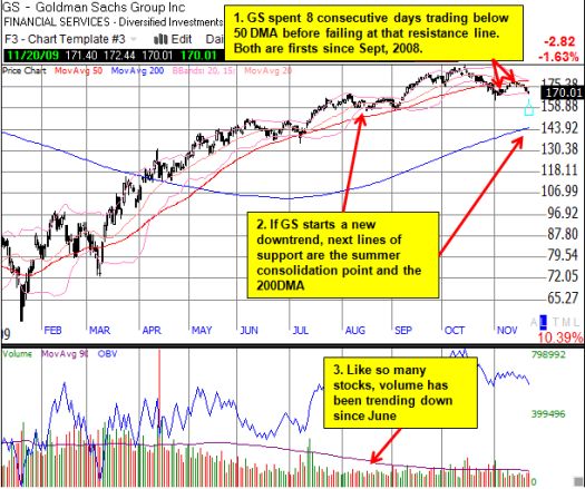
However, in November, the stock chart for GS has taken an ominous turn. The 50-day moving average (DMA) has suddenly changed from strong support to potential resistance. When GS traded below the 50DMA on October 28, it was the first such move since the July lows. This time, GS did not make a new low on the way to a new leg up. Instead, it traded back above the 50DMA for one day before proceeding to trade below the 50DMA for 8 consecutive days. This was the longest such stretch since September, 2008. The retest of the 50DMA failed and turned former support into resistance. GS has now traded below the 50DMA for another 7 straight days.
GS is 50 cents away from a new closing low for November. If this milestone triggers, GS will set a new (short-term) downtrend. This will be the first such downtrend since a short stretch in February and March of this year.
The chart below summarizes the current technical situation and additional lines of support:

*Chart created using TeleChart:

In early October, I described GS as my biggest miss of the year. I am now much more interested in observing whether GS is leading the rest of the market down rather than looking for a new buying entry point.
Be careful out there!
Full disclosure: no positions.

1 thought on “Goldman Sachs Stock Chart Takes An Ominous Turn”