
For over two months, I have gained some valuable experience and lessons putting the formalized Apple Trading Model (ATM) into practice. I have experienced two main challenges: 1) balancing the sometimes conflicting messages of the ATM when using different amounts of historical data, and 2) plain old execution.
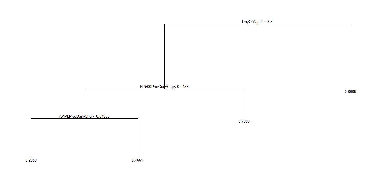
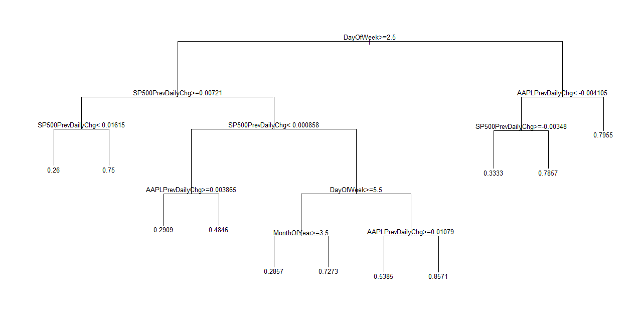
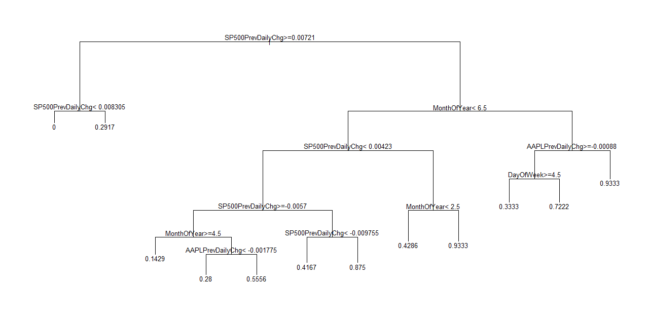
For challenge #1, I have concluded that the latest data (year-to-date for 2013) provides the most reliable signal of the four models – historical data since 2010, since 2011, since 2012, and year-to-date for 2013. (This could change as the latest update of the ATM places the 2013 model with a slightly higher classification error). See below for the updated models using data through September 9, 2013. Those of you who are familiar with the original posting on the the ATM will see only subtle changes. I am currently using the multiple models to identify any changing trends in the way Apple (AAPL) behaves day-to-day. I update the historical data regularly. Going forward, I will try to post a monthly update.
I also added a new machine learning technique called Naive Bayes to provide a check on accuracy. Unfortunately, Naive Bayes consistently performs worse than the regression tree model. I continue to monitor and compare its results but generally it does not add anything useful to the trading. It is just as well. The mechanics of the regression tree are a lot easier to explain: it acts like a nice decision algorithm.
For challenge #2, I have failed to execute on some of the most profitable days since I started using the ATM. The problem has sometimes been related to challenge #1 above. I believe those issues are now ironed out. Sometimes I just plain choose to stand down and observe what happens (a good thing for learning). Other times, I just plain missed the boat. Interestingly, there were two occasions where I ignored the ATM model and played for what I still think is the typical Friday pullback; both times were successful. For whatever reason, the model’s biggest weakness has been in anticipating Friday pullbacks.
Here are the updates to the model along with reminders on interpretation.
DayOfWeek = the day of the week where 2 to 6 means Monday to Friday.
MonthOfYear = the month of the year where 1 to 12 means January to December.
SP500PrevDailyChg = the change in value of the S&P 500 on the trading day prior to “DayOfWeek.” Multiply by 100 to get the percentage.
AAPLPrevDailyChg = the change in value of AAPL on the trading day prior to “DayOfWeek.” Multiply by 100 to get the percentage.
The trees classify historical data. They DO NOT predict the future. The numbers in the tree represent the percentage of times (multiply by 100) that a particular sequence of conditions have occurred in the historical data used to create the tree. Using historical frequencies to trade the future uses a strong assumption that tomorrow will more than likely act like recent history. This is a relatively good assumption until some fundamental character of AAPL’s trading changes. Such changes will not likely be evident right away, and I will not know in advance how long it will take to notice the difference. For example, I may not notice until a particular frequency drops below my 60-70% threshold. I formerly set the threshold at 60%, but I now recognize I need to be a bit more flexible. (One great addition to the model is a formalized definition of trend in the frequencies).
Sequences are defined by the branches in the tree. The direction you take on the tree to a final “probability” depends on the conditions labeled throughout the tree. For example, SP500PrevDailyChg>=.00721 means take the left branch of the tree if the S&P 500’s previous daily change was greater than or equal to 0.721%. Take the right branch of the tree otherwise. Follow these conditions until you reach a terminal (or leaf) node on the tree. This termination produces a number from 0 to 1 that we treat as the likelihood that AAPL will close UP the next trading day.
Finally, note very well that this model does not produce a forecast for the magnitude of Apple’s price change. This is a definite weakness. For more details on the importance of this deficiency, see Nassim Taleb’s latest interview on EconTalk: “Taleb on Skin in the Game.” I have tried including magnitude by creating multiple classifications ike 1 to 4 for below -1%, -1% to 0%, 0 to 1%, and above 1%. The performance was unsurprisingly dismal: trying to capture enough variables that influence the magnitude of change is extremely difficult. While it is certainly possible I will crack the code one day, I am not counting on it!
I mainly cope with this weakness by using (short-term) options. In this way, losses are always and automatically capped, and I can experience as much upside as Apple will grant. The ATM succeeds where the upside delivers “sufficiently large gains” a “sufficient number of times.” It is NOT necessary to be correct a majority of the time even as the classification errors suggest I should be.
Here are the updated models, including the classification errors. Classification errors describe the rate of expected misclassification from blindly using the model EVERY day.
(Click images for larger view)

Classification error = 25%
Classification error = 26%
Classification error = 28%
Classification error = 32%
I end this update with an important example that happened in the wake of Apple’s big product announcement today. With about 20 minutes left until the close, I ran the ATM as if the market had just closed. The S&P 500 (SPY) was up about 0.6%. The 2013 ATM generated an amazing 93% chance of an up close for the following day. With AAPL down over 2%, presumably with a lot of immediate downside beaten out of the stock, I took that signal as an automatic buy. I was so excited about such a high likelihood that I tweeted the result and immediately bought call options expiring September 21st (yes, I put skin in the game). I did not buy my usual weekly option because I had an eye for Apple’s tendency to trade more weakly as the week wears on. I purposely bought myself time. It turns out that I will likely need that time (and/or look to sell these calls on the first pop I get on Wednesday).
The S&P 500 ended the day up 0.73%. This is just enough to send the regression tree in a completely different direction. If you are reading the tree correctly, you will notice that the ATM produced essentially the exact opposite result! A 100% chance for a down day. I got this result after the market closed, and you can imagine how my jaw dropped on this turn-around.
Ordinarily, I would think of this behavior as characteristic of an unstable model. However, this behavior highlighted for me some extremely interesting and strong patterns in Apple this year. This 0.72% threshold for the previous price change on the S&P 500 has been extremely critical. I went back to the data and filtered according to the rules of the tree and found some amazing stats…
During 2013, when the S&P 500 has changed in value greater than or equal to 0.721%, not only has AAPL traded down 24 out of 31 days, but also this behavior is particularly pronounced on Wednesdays. The regression tree does not show this: 10 out of 11 Tuesdays where the S&P 500 has closed above 0.721% has produced a down Wednesday for AAPL. Seven of the ten down days were -1% or worse. Note well that AAPL’s performance on the prior day has absolutely nothing to do with these odds. Why is it that AAPL seems so strongly influenced by the S&P 500’s close? Only the trading Gods know. Whatever the reason, this is a very strong pattern to follow.
Finally, the technicals on AAPL are looking very good, even with today’s sell the news drop. These technicals also motivated my quick purchase of the call options and the desire to buy more time since a Bollinger Band squeeze is underway. I think the squeeze could be quite powerful for AAPL, creating a boom or bust scenario. So far, the bias remains to the uspide given the uptrend 20-day moving average (DMA) is still holding up and the 50 and 200DMAs are converging to likely form firm support below. Overhead resistance remains from the point where the January earnings gap down was closed. A gap above this level will be my ideal scenario as it would likely ignite fresh buying and a sustained rally. Also notice AAPL is still clinging to its “post-Icahn” gains.
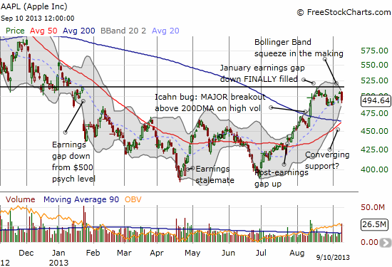
Source: FreeStockCharts.com
Be careful out there!
Full disclosure: long AAPL shares and call options