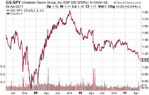
Every now and then, I check in on the chart of Goldman Sachs (GS) as a potential indicator of the underlying health of the stock market. This year, I have been consistently surprised at Goldman’s persistent relative weakness compared to the general market. After recently refreshing my chart of the S&P 500 price in gold, it finally occurred to me to chart Goldman relative to the S&P 500. I was quite surprised to find that Goldman has been declining relative to the S&P 500 ever since GS last made a 52-week high in October, 2009.

Source: stockcharts.com
(I used SPY instead of the underlying index just to get the ratio in single digits).
GS last made a 52-week high in October, 2009, just seven months following the March, 2009 lows for the general market. The stock has been grinding lower in slow motion ever since. In contrast, the S&P 500 is now at multi-year highs. So, a two-year low for GS vs the S&P 500 makes perfect sense.
It is not clear to me whether this relationship is anything more than a technical oddity, but I am fascinated nonetheless. It seems to me that either GS is very undervalued (relatively) or GS’s decline is like a clock slowly ticking away time for the general market.
Be careful out there!
Full disclosures: long SSO puts
