
Above the 50 (AT50) Replaces Above the 40 (AT40)
I had a long and rewarding journey using AT40 (T2108), the percentage of stocks trading above their respective 40-day moving averages (DMAs), as my key measure of market breadth. Over the past several years Worden and its TC2000 platform gradually reduced support for the FreeStockCharts platform that I use for tracking and downloading AT40 data. I worked around increasingly restrictive conditions, but with this post I end those efforts. Now I introduce readers to Above the 50 or AT50, the percentage of stocks trading above their respective 50DMAs, as my key measure of market breadth.
This change improves my ability to report on market breadth. I created a simple conversion of the AT40-based definitions of overbought and oversold to interpret AT50. All my past analyses of overbought and oversold conditions still apply. Based on my analysis, I left the percentage thresholds at their current levels.
- Above the 50, AT50, is overbought above 70%
- Above the 50, AT50, is oversold below 20%
TraderView.com provides free access to AT50 with the symbol MMFI. Readers do not need to wait for updates from One-Twenty Two on market breadth to get the latest values. Going forward, I will use candlestick charts like the one below to display the market breadth information from AT50:
The Technicals of Converting from Above the 40 to Above the 50
Converting from Above the 40 to Above the 50 is relatively straightforward because the two measures are closely correlated. TradingView provides historical data back to January 2, 2002. Worden provides historical T2108 data back to 1987. The correlation over 8 1/2 years is 0.95. Over 20 years the correlation is 0.95. Thus, the relationship looks sufficiently consistent over time.
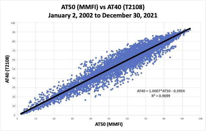
Each blue dot above represents a single day with AT50 mapped versus AT40. The correlation between AT50 and AT40 are highest at the extremes and worst in the middle. The correlation is better at the lower extreme than the higher extreme. Fortunately, the extremes of market breadth provide the most information for trading (overbought and oversold). The equation shown in the chart comes from the black diagonal trend line.
The linear approximation of the above scatter plot provides the new threshold values. AT50 overbought = ([AT40 Overbought = 70] – .3954) / 1.0007 = 70%. AT50 oversold = ([AT40 Oversold = 20] – .3954) / 1.0007 = 20%. So while wide variability exists in the relationship between AT50 and AT40 in the middle of the 0% to 100% range, the relationship works well at the extremes.
The Precision of the New Overbought and Oversold Thresholds
I examined the precision of the new overbought and oversold thresholds to add a layer of reassurance for this conversion.
Over the 20 years of data, the minimum value for AT50 for any AT40 overbought period is 55%. Accordingly, capturing any and all AT40 overbought periods requires triggering the overbought trading rules with AT50 above 55%. This conservative approach to eliminating false negatives for overbought provides 100% recall but poor precision. Using 100% recall would trigger overbought trading conditions 54% of the time based on the past 20 years of history. Something that happens the majority of the time is not an extreme! Thus, for trading extreme market conditions, precision is more important than recall.
The maximum possible value for AT50 for any AT40 oversold period was 42%. Even intuitively, traders can recognize that 42% is not low enough to define meaningful oversold conditions. Indeed, AT50 has traded below 42% for 25% of the trading days in the past 20 years.
Precision in Chart Form
The charts below provide a visual of these relationships. Each bar defines a “bin” which is a range of values. For example, think of the 70% bar as representative of all percentages starting with 70, like 70.1, 70.5, 70.9, 70.99, etc… The green bar marks the threshold for overbought in the first chart and oversold in the second chart. The yellow bars provide alternative thresholds based on the relatively high odds. The height of the bar represents the “odds” that AT40 is overbought (or oversold) given the value of AT50 on the x-axis. I calculated the odds as the percentage of time that AT40 is overbought (or oversold) given the value of AT50 over 20 years of data.
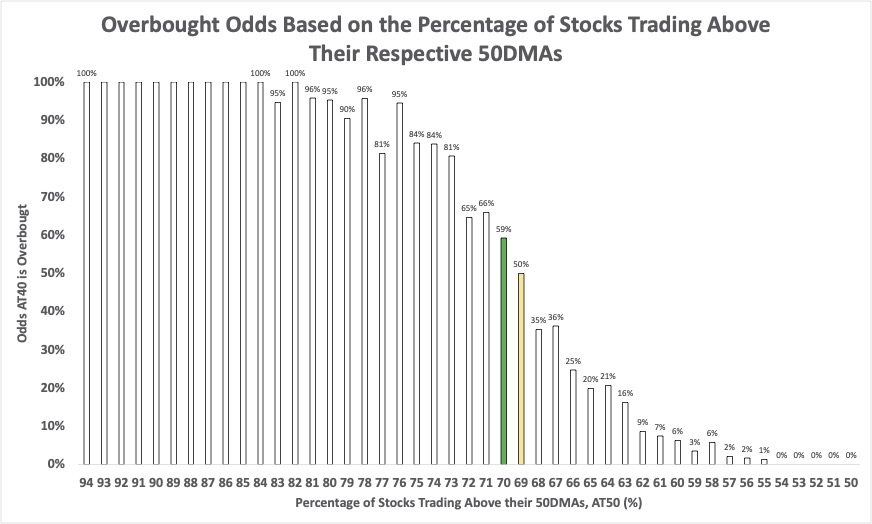
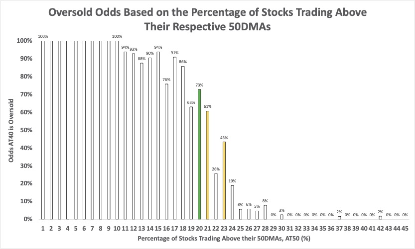
These charts show that the oversold trading period is more distinct than the overbought trading period relative to the AT40 definitions. Of course, if I started my work from AT50, this fuzziness would not be an issue. Regardless, traders should not treat the overbought and oversold thresholds as numbers fixed in stone. When the stock market approaches these thresholds, I use other data to identify when trading conditions are “close enough” to oversold or overbought. For oversold conditions, the volatility index (VIX) is useful. For overbought conditions, I look for signs of buying exhaustion as the stock market falls out of or away from overbought territory.
How to Use Above the 50
The AT50 overbought and oversold thresholds allow me to use all my AT40 analyses and relationships. The implications of overbought and oversold trading conditions remain the same as always. Now, readers can access the latest indicators of stock market breadth at any time on a charting platform that is free and available on any device and operating system.
Be careful out there!
{updated December 31, 2021}
I’m happy to see this change, and to see that T2108 and MMFI converge at their extrema. Since MMFI and MMTH are easily available, now I can start from the same base to explore ideas inspired by your work.
I am looking forward to seeing those ideas!
This is a great improvement I think since I can now track AT50 daily. Very helpful and thanks for sharing. Dr. Duru’s stock analyzing techniques are very accurate and have helped me a lot over the years.
Thanks, Sam. I am glad this site has helped you over the years!