
(T2108 measures the percentage of stocks trading above their respective 40-day moving averages [DMAs]. To learn more about it, see my T2108 Resource Page. You can follow real-time T2108 commentary on twitter using the #T2108 hashtag. T2108-related trades and other trades are posted on twitter using the #120trade hashtag)
T2108 Status: 82% (overbought day #37)
VIX Status: 17.3
General (Short-term) Trading Call: Close more bullish positions. Begin but do NOT expand an existing bearish position.
Reference Charts (click for view of last 6 months from Stockcharts.com):
S&P 500 or SPY
SDS (ProShares UltraShort S&P500)
U.S. Dollar Index (volatility index)
VIX (volatility index)
VXX (iPath S&P 500 VIX Short-Term Futures ETN)
EWG (iShares MSCI Germany Index Fund)
Commentary
T2108 closed at 82% – the 37th overbought day in a row. T2108 is now ranked #8 in duration amongst all overbought periods since 1986, placing it in the 96th percentile.
Despite these historic numbers, T2108 continued a slight downtrend that has subtly built up over the past two weeks. For example, on Wednesday, T2108 dropped to 80% for the second time in two weeks. This is notable given T2108 has stayed above 80% ever since mid-January. The S&P 500 is also demonstrating the slowing momentum. The daily chart below shows the S&P 500 pulling away from 52-week and multi-year highs for the second time in a week. Even more alarming is the continuing decline in volume. The blue line in the volume area is the 90-day moving average. It is hard to imagine the S&P 500 making a convincing breakout without buyers showing up in force.

I have pointed out the low trading volume in the past and that has not mattered to stock prices. The stock market has generally suffered low buying volumes for almost three years as investors continue to pull away from stocks. Volume is one of those things that only matters when it does…and what it does, the selling can get swift and furious given the lack of general support and interest in the overall market. In other words, sellers are easy to find and quick to pull the trigger when given a reason.
In related news, the volatility index, the VIX, is trading near 7-month lows again. It bounced sharply on Friday from a 7-month closing low. This is a critical juncture where a further breakdown will take complacency to nosebleed levels (in my opinion).
I have not commented on the trading strategy in quite some time because T2108 has showed so little change. However, NOW, I am highly recommending that if you do not yet have some kind of short position in place, that you get started. I am NOT advising putting on a full position because the historical record suggests that the S&P 500 may still have a few more percentage points of gains ahead before the overbought period finally ends. In case the declining volume does indicate the stock market’s fuel is running low, a bearish trader wants to make sure s/he is ready for the high likelihood of a swift correction. If the few more percentage points arrive, I am forecasting this will mark a false breakout that should suck in the market’s last few reluctant buyers. No matter the size of your bearish position, you will want to fade that move rather aggressively. Stay tuned…!
Charts below are the latest snapshots of T2108 (and the S&P 500)
Refresh browser if the charts are the same as the last T2108 update.
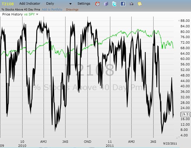
Daily T2108 vs the S&P 500
")
Black line: T2108 (measured on the right); Green line: S&P 500 (for comparative purposes)
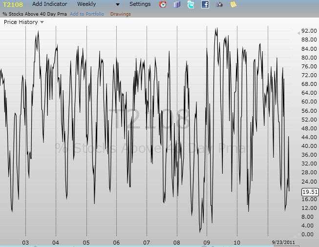
Weekly T2108

*All charts created using freestockcharts.com unless otherwise stated
Related links:
The T2108 Resource Page
Expanded daily chart of T2108 versus the S&P 500
Expanded weekly chart of T2108
Be careful out there!
Full disclosure: long SDS and VXX; long VXX puts
A lot of breadth indicators topped around 2/3/2012. Here’s the sector performance since then:
XLE: 4.8%
XLK: 4.0%
XLP: 1.8%
XLY: 1.4%
XLU: 0.7%
XLI: 0.6%
XLV: -0.1%
XLF: -0.5%
XLB: -0.9%
To me, this says that tech & energy are responsible for the current strength and that we’re not going to see the pullback until these guys take a breather.
That’s a great perspective. With oil running up the way it is, I don’t think energy is cooling off in the coming week. Of course, eventually, folks might start caring about how high energy prices might impact the economic recovery.
Tech is the most intriguing one to me. With Apple in the driver’s seat, we might as well say until Apple cools off, the market won’t either. Yet Apple did print a topping pattern (major reversal) that is already being challenged. A major test of highs should come this week.
Thanks again for pointing this out in the form of ETF performance.
To try to determine whether the components of XLK/XLE are breaking out to new highs, or whether they’re breaking down, I browsed FINVIZ’s screener and looked at the (distance from) 52W High column:
http://finviz.com/screener.ashx?v=151&f=sec_technology&o=-high52w
Based on this snapshot, it doesn’t seem like there’s a ton of new highs being made every day, suggesting that perhaps more components are breaking down (or going nowhere) instead of breaking out (up).
But this was just from a casual look, I didn’t write a program to analyze the data or create a XLK/XLE new high / new low chart (like a sector version of stockcharts.com’s $USHL).
$USHL is a nifty chart. Very dramatic to see it swing to negative extremes in August and October. Have you built tecnicals signals off this indicator?
I haven’t been able to build a convincing technical signal off of $USHL, other than looking for extremes.
For example, I called the Oct 4 bottom (papertrading) by noticing the extreme -2223 value (exceeding the recent values of -1602 and -1477) as well as noticing the powerful intraday reversal to the upside. (Looking back in time on your blog, looks like you called this bottom as well, nice)
This is one reason Feb 3 stands out for me: $USHL went to an extreme 449, then pulled back and hasn’t broken the ~300 level since then. This tells me that stocks overall are not hitting their highs as much anymore. In other words, the pullback has already begun for some stocks.
I think the good news is that correlations have gone down, as evidenced by the fact that everything hasn’t pulled back simultaneously (or just look at ICJ in freestockcharts.com). I think these lower correlations are a sign of health to some degree, so even if there is a pullback, I expect more upside in the coming months.
Here’s a few resources I’ve found about using $USHL (or similar freestockcharts.com indicators) for market timing:
http://www.chrisperruna.com/2009/05/11/nh-nl-picks-market-tops-and-bottoms/comment-page-1/#comment-21489
http://www.chrisperruna.com/2011/10/06/market-bottoms-using-new-high-new-low-extreme-readings/
ICJ looks like a new index for FreeStockCharts.com. It has been in decline during this entire rally, not just since Feb 3rd. However, it is interesting to note that the $USHL’s peak coincides with the Russell 2000’s peak. In other words, it seems that it is small cap stocks that are the first to lose the momentum. These could be stocks that should never have gotten as high as they did in the first place and were just riding either a January effect and/or the coattails of the bullish trading action. As I type this, I am realizing that if my characterization is true, then the next phase of selling could take quite a bit more time…until at least, as you said in another comment, some catalyst comes around that knocks even the good stocks down.
Sentimentrader notes just how rare the Russell 2000 divergence is:
http://twitter.com/#!/cperruna/statuses/176313718886514689
Though I looked at the Mar 2000 charts and that situation seems quite different than now (back then the Russell 2000 had a huge run up compared to the S&P 500).
What data makes you think that the next phase of selling could take quite a bit of time? No one can predict the future perfectly, so unless you have specific data, I wouldn’t beat myself up too much. The best one can hope for is to have a variety of signals that tell you ‘historically time X is riskier than time Y due to factor Z’. 🙂
It was definitely just a guess. I am thinking without a catalyst, it will take a lot more time for the stronger leaders to fall. But seeing that Rydex data makes me revert right back to my original expectation that a correction is imminent…
I retweeted that stat. Fascinating how all these signals are coming together, eh? Record this. Unusual that. Extremes all around…