
(T2108 measures the percentage of stocks trading above their respective 40-day moving averages [DMAs]. To learn more about it, see my T2108 Resource Page. You can follow real-time T2108 commentary on twitter using the #T2108 hashtag. T2108-related trades and other trades are posted on twitter using the #120trade hashtag)
T2108 Status: 85% (overbought day #18)
VIX Status: 18.5
General (Short-term) Trading Call: Close more bullish positions, begin/expand bearish positions
Reference Charts (click for view of last 6 months from Stockcharts.com):
S&P 500 or SPY
SDS (ProShares UltraShort S&P500)
U.S. Dollar Index (volatility index)
VIX (volatility index)
VXX (iPath S&P 500 VIX Short-Term Futures ETN)
EWG (iShares MSCI Germany Index Fund)
Commentary
T2108 closed for an 18th straight day in overbought territory as the metronome ticks on. The ONE small difference in the market’s behavior is that the S&P 500 finally had two down days in a row. This has not happened for the entire duration of this rally off the December lows. As usual, trading volume INCREASED on the selling. See the last T2108 update for an analysis of the extremely light trading volume for this rally.
The S&P 500 is also finally working off overbought stochastics with three out of the last four trading days closing in negative territory. You should also note that the 50DMA and 200DMAs have now converged at 1256. This should provide firm support in the next market sell-off. I will interpret a break of this support as a very bearish event.
The T2108 overbought conditions continue to creep toward extremes. At day #20, the market will be at the 88th percentile for overbought durations. After day #24, the tail of the distribution gets very thin. The top 4% of overbought periods in terms of duration lasted at least 45 days. For more details see “Trading Strategies for an Overbought S&P 500 Using the Percentage of Stocks Trading Above Their 40DMAs (‘T2108’)“.
A good friend of mine recently asked me to compare this period to 2003. If you recall, 2003 was the first year of the bull market that emerged from the 2001 recession. The final catalyst for a bottom was the launch of the invasion of Iraq. It felt like a horrible time to invest and oil analysts assumed that oil prices would plummet in the expectation of a fresh gush of supply freed by U.S. forces. Instead, it turned out to be an excellent time to invest, especially in oil.
Today, the stock market is once again challenging major highs. The highs made May 1, 2011 were three-year highs. The natural question is whether the market anticipates some gold on the other side of the green hills that we simply cannot see because of distracting negative news. I daresay quite the contrary. The market is learning to ignore the negative news exactly because every single sell-off since March, 2009 has generated great buying opportunities. This year’s equivalent to 2003’s invasion of Iraq might be a catastrophic outcome in the European sovereign debt crisis that finally forces monetary and government authorities to take drastic actions. I am not saying such a thing will happen, I am just noting that the crisis in Europe has yet to generate any real cataclysmic event, more like a series of mini-panics that eventually give way to standard complacency.
I also looked at a quarterly chart to compare the last bull market to the current one. The last bull market was a barn-burner in the classic bullish sense. The market just kept rising and rising. An intrepid investor could just deposit $100 every month and sit back and enjoy the ride (until 2008 of course). This time around, investors have not had it so easy. Two major sell-offs have shaken many out of the market. Trading volume as been very anemic relative to the previous bull market, getting worse as the distance increases from the March, 2009 lows. This trading volume includes the well-noted over-inflation caused by trading in single-digit wonders like Citigroup (for example see an August, 2009 CNN Money article titled “Stocks led by four wounded horsemen“). The upward pressure in the market has not been straight at all. Finally, if you stare hard enough, you might swear the S&P 500 seems like it is losing steam, especially if this quarter does not end with new highs.

Although T2108 is all about short-term technical analysis and trading, it sometimes helps to take a step back and understand the overall context in which events are unfolding. I see the above chart, and I cannot help but believe that the fall from this overbought period will feature another steep sell-off. Stay tuned…
Charts below are the latest snapshots of T2108 (and the S&P 500)
Refresh browser if the charts are the same as the last T2108 update.
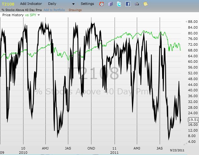
Daily T2108 vs the S&P 500
")
Black line: T2108 (measured on the right); Green line: S&P 500 (for comparative purposes)
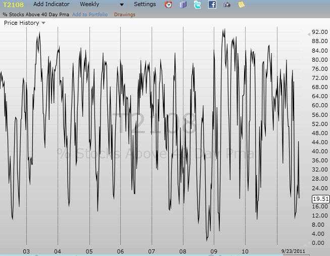
Weekly T2108

*All charts created using freestockcharts.com unless otherwise stated
Related links:
The T2108 Resource Page
Expanded daily chart of T2108 versus the S&P 500
Expanded weekly chart of T2108
Be careful out there!
Full disclosure: long SDS; long VXX