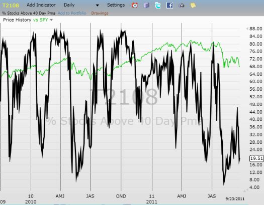
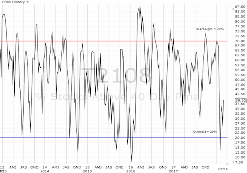
(T2108 measures the percentage of stocks trading above their respective 40-day moving averages [DMAs]. To learn more about it, see my T2108 Resource Page. You can follow real-time T2108 commentary on twitter using the #T2108 hashtag.)
T2108 Status: 9.6% (Day #5 of the current oversold period).
VIX Status: 43 (2nd highest close of oversold period).
General (Short-term) Trading Call: Finish building bullish positions. Lock in profits on some remaining bearish positions.
Commentary
The stock market had a strange day that I think represents a bullish divergence. T2108 managed to close up 2 percentage points while the S&P 500 dropped 4.4% and wiped out all its gains from yesterday. The positive T2108 move is supported by T2107 (the percentage of stocks trading above their 200DMAs) moving up two percentage points to 17%. This bullish divergence was likely caused by a few stocks that are campaigning to be leaders for any rally out of this oversold period. I did a quick scan of stocks that closed up on the day, but I did not find any obvious candidates (sorry I do not have more time to study this in more detail!).
Needless to say, today’s losses in the stock market were a great example of why I have advised buying stocks on dips (NOT chasing them up) and closely managing risk so that the portfolio can withstand lower prices. This oversold period is one of the most extreme since 1987, so traders must brace themselves…dare I say even brace for a Black Swan event? The interesting thing about pondering the possibilities of a Black Swan is that the unthinkable move could be a monster up move. We can only hope, eh?
Away from the long tail and back to the land of averages, I will remind you that the average oversold period lasts six days – this is now day number five. This oversold period is sure to be above average. However, the odds still favor a bottom for the S&P 500 for this oversold period on the assumption that the VIX topped out on August 8.
Charts below are the latest snapshots of T2108 (and the S&P 500)
Refresh browser if the charts are the same as the last T2108 update.
Daily T2108 vs the S&P 500

Black line: T2108 (measured on the right); Red line: S&P 500 (for comparative purposes)
Weekly T2108

*All charts created using TeleChart:

Related links:
The T2108 Resource Page
Expanded daily chart of T2108 versus the S&P 500
Expanded weekly chart of T2108
Be careful out there!
Full disclosure: long shares and calls on SSO; long puts on VXX
