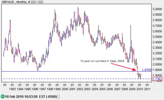
The Australian dollar is my favorite currency. I have remained very bearish on the British pound since first writing about the currency last September (yes, there actually IS a currency I dislike more than the U.S. dollar!). For whatever reason, it only recently occurred to me to pull up a long-term chart comparing these two currencies. I should not have been surprised at what I found, but I was startled anyway. The British pound has been printing fresh multi-decade lows against the Australian dollar since last September. The data in the monthly chart below “only” goes back to 1992.

*Chart from dailyfx.com power charts
Seeing a chart like this reminds me that de facto competitive devaluation is occurring amongst the major developed economies. If you agree with this perspective, then you also understand another reason why the Germans may balk at helping Greece too fast, too soon, or with too much. Greece’s sovereign debt crisis has finally brought the euro back down to earth – even against the lowly pound – making German exports cheaper again. Of course, at this point, any solution may simply alter the speed of the euro’s decline, not the direction.
Last year, Germany lost its number one exporter spot to China. The rapid appreciation of the euro against the U.S. dollar was often cited as a major source of pain. The pain is rapidly easing…
(Apparently, BNP Paribas is advocating further euro devaluation to help Europe through its debt crisis.)
Be careful out there!
Full disclosure: long FXA
